What is a Color Wheel?
RYB Color Wheel
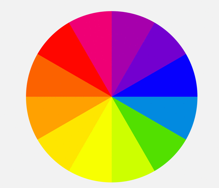
Now that we understand different types of primary colors, we can begin to understand the color wheel. As old as color theory itself, the color wheel originated with Isaac Newton’s color circle published in 1665. The theory behind a color wheel is that it shows the relationship between primary, secondary, and tertiary colors, all evenly spaced in a circle.
Using the common RYB model as an example, we can see a color wheel with red, yellow, and blue spaced evenly around a circle. Corresponding secondary colors (green, purple, and orange) sit evenly between the two colors they are mixed from. So, in the case of RYB we see green between blue and yellow, purple between blue and red, and orange between yellow and red.
The circle is rounded out by tertiary colors, which are created by mixing one primary color with one secondary color. For instance, teal would be considered a tertiary color using the RYB color wheel, originating from a mix of blue (primary) and green (secondary). If you keep mixing you’ll get quaternary and then quinary colors, eventually getting into shades of grey.
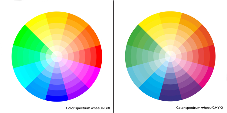
Photo: Plateresca via Shutterstock
These basic color wheel principals work for CMY and RGB, just with different results. Interestingly, in CMY, red and blue become secondary colors, as opposed to their role as primary colors in RYB. Color wheels can be as simple or complex as you’d like and, over the course of history, many scholars created beautiful color wheels to show the full range of hues found in the world.
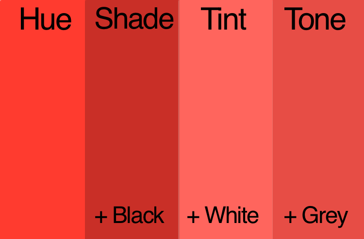
Some color wheels will also go into detail about variations on the pure color. Moving toward a white center they may show different tints of the pure color. A tint is achieved by the addition of white. Or, they may focus on demonstrating different shades, which are achieved by adding black to the pure color. You may even see some that display different tones, which is when grey is added to the pure color. Tints, shades, and tones are helpful depending on the color effect you are looking for. For instance, tones tend to be more subtle.
Warm Colors vs Cool Colors
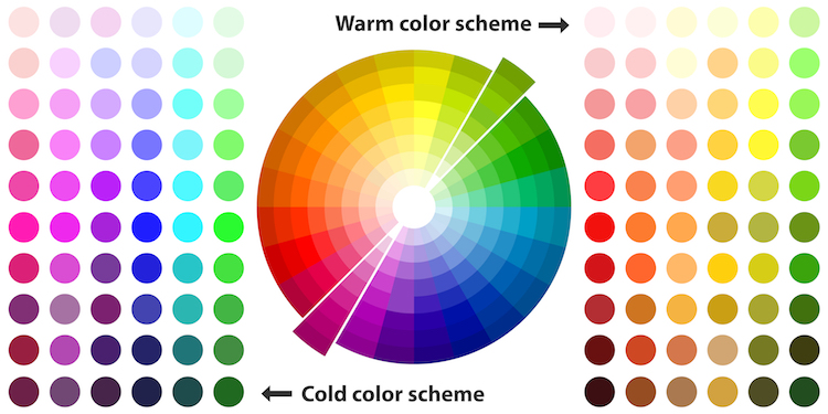
Photo: Mr. Luck via Shutterstock
Draw a line down the middle of any color wheel and you’ll separate warm and cool colors. Color theory has assigned psychological differences to warm and cool colors. Warm colors, which include red and yellow hues, as well as more tans and browns, are said to “advance” in art. Associated with sunset and daylight, they are often perceived as inviting and stimulating. Cool colors, which include blue-greens to blue-violets are said to “recede” in art. Cool colors have links to overcast, wintery days and are considered calming and relaxing.
Cool and warm are also relative, meaning you can have a cool red and warm red depending on what side of the pure color they sit next to. For instance, reds with more orange to them will be considered warm, while reds with more purple and blue undertones will fall into the cool category.
Color Harmony
Once you have a handle on the basic primary color models and how the color wheel is organized, it’s time to see how you can use color theory to your advantage. Those adept at color theory will have an easier time selecting color palettes for their projects and more easily achieve the results they desire. So whether you are picking out a piece of art for your home, painting your walls, or creating a new website, understanding how to create a successful color scheme is a must.
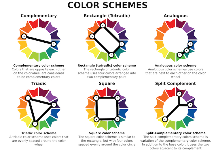
Photo: Slave SPB via Shutterstock
Complementary
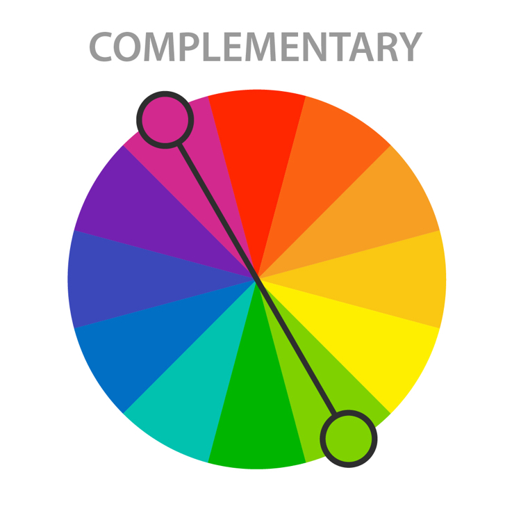
Photo: Macrovector via Shutterstock
Complementary colors are two colors that sit directly across from each other on the color wheel. Red and green, for instance, are complementary colors. A color scheme based on complementary colors will be quite vibrant, as the two colors contrast against one another. The stark contrast can make it difficult to work with on a large scale; but, used in small doses, it’s a great way to pull attention to a particular area.
Analogous
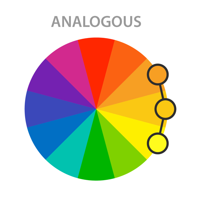
Photo: Macrovector via Shutterstock
Analogous colors sit directly next to one another on the color wheel and can be very effective in creating a calm, serene feeling. Analogous color schemes can often be found in nature and when used, typically one color dominates. The second color supports the dominant color, while the third is used primarily as an accent. The colors are already harmonious, so you’ll want to be sure there is enough contrast to make your design pop.
Triadic

Photo: Macrovector via Shutterstock
While not the easiest color scheme to use, if done right it can yield great results. Draw a triangle on the wheel and you’ll hit on three colors equally spaced apart. For instance, purple, orange, and green (the secondary colors). Triadic colors are quite vibrant and rich, so to use them effectively you’ll want to choose one dominant color and use the other two as accents.
Split-Complementary
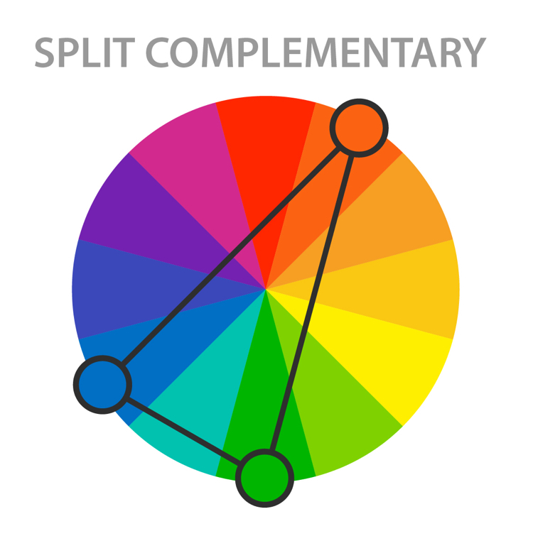
Photo: Macrovector via Shutterstock
This variation on a complementary color scheme is often used because it’s a little less jarring. Instead of drawing a straight line across the wheel, a split-complementary color scheme uses one base color and two additional colors that are adjacent to the base color’s complement. So, if red-orange (vermillion) is the base color, the other two colors in the scheme would be blue and green. The results are still vibrant, but as the contrast isn’t so strong it’s easier for beginners to work with.
Tetradic

Photo: Macrovector via Shutterstock
This rectangular color scheme uses four colors broken into two complementary pairs. This rich color scheme can be tricky to manage but allows for a lot of variety. It works best if one color is dominant or if the colors are subdued. By using all colors equally, the overall design may appear unbalanced. Another characteristic to consider is the balance between warm and cool colors.
Square

Photo: Macrovector via Shutterstock
The square color scheme also uses four colors, but this time they are all spaced evenly around the wheel. Similarly to tetradic colors, this palette works best if one color dominates and the others are accents. Otherwise, it can look sloppy. Attention to warm and cool colors is also a must here.
Achromatic
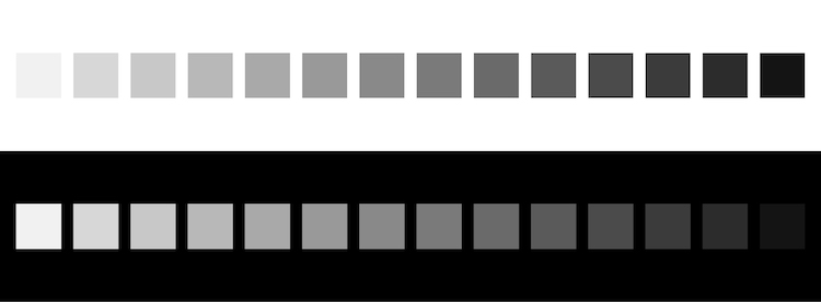
Photo: blue-bubble via Shutterstock
Often used to create a clean, minimalist look, an achromatic color scheme exclusively uses black, white, and shades of grey. Designers will often throw in an accent color to create interest or break up the neutral design.
Monochromatic

Photo: Sgustok via Shutterstock
A monochromatic color scheme takes one hue and creates a design based on different tints, tones, and shares of the hue. This color scheme allows for cohesion and relies on contrasting tones to attract attention or create focus.
Now that you know the basics of color theory, it’s time to add color to your next big project!
Related Articles:
Top 5 Free Color Palette Generators to Make Color Selection a Breeze
Japanese Designers Create Nameless Paints to Revolutionize How Children Learn about Colors
Design Lover Reveals Striking Color Palettes of Beloved TV Shows, Films, and Music Videos
13 Best Watercolor Paint Sets Both Beginners and Professional Artists Will Love