Photo: KRIACHKO OLEKSII via Shutterstock
This post may contain affiliate links. If you make a purchase, My Modern Met may earn an affiliate commission. Please read our disclosure for more info.
Color is one of the seven elements of art and one of the first things we learn in school. Understanding the basic primary colors and how they blend is an activity found in most elementary school classrooms, but that’s just one piece of a much larger field known as color theory.
Used by painters, graphic designers, interior decorators, and anyone working in visual culture, color theory is an essential part of any creative’s toolkit. By understanding the principles of color and the science behind how we perceive different hues, creatives are able to mix, match, and blend a wide range of colors to please the eye.
The History of Color Theory

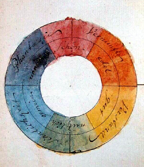
Color wheel by Johann Wolfgang von Goethe, 1809. (Photo: [Public domain], via Wikimedia Commons
While it may seem like standard theories about color have always existed, that’s not the case. Of course, colors like blue have been around since ancient times, when the Egyptians learned how to create permanent pigments from minerals. Even Leonardo da Vinci explored color principles in his extensive notebooks. However, it wasn’t until the 18th century that color theory began to formally take shape.
Initial explorations in color were from a scientific point of view. Isaac Newton, in his 1704 book Opticks made a breakthrough in proving that light was made of different colors. Controversial at the time—as it was thought that pure light was colorless—his experiments became important stepping stones for color theory. He even organized an early color wheel based off of the color combinations he saw when refracting light through a prism.
Later publications, The Theory of Colours by German poet Johann Wolfgang von Goethe and The Law of Simultaneous Color Contrast by French chemist Michel Eugene Chevreul, are considered the founding documents of color theory. Published in the early 19th century, they deal with color psychology and chromatic aberration, and they further refined the color wheel.
At that time, color theory was based on RYB primary colors, which defined red, yellow, and blue as the colors capable of mixing all hues. This is the scheme most commonly taught in grade school and is still used in mixing paints. Later scholars would switch to an RGB (red, green, blue) and CMY (cyan, magenta, yellow) models as advances in technology increased the range of synthetic pigments in photography and printing.

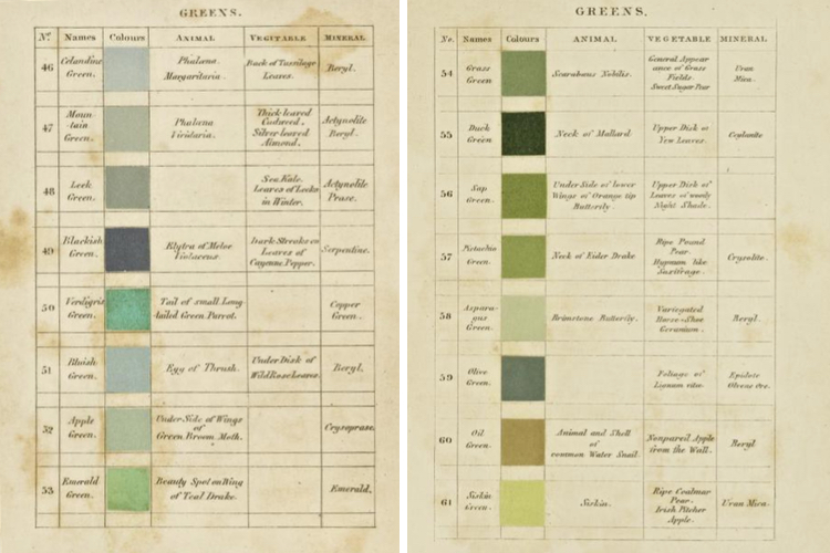
Werner’s Nomenclature of Colors, 1821. (Photo: Getty Research Institute via Internet Archive)
The 19th century brou’ght about many books on color theory and how it can be applied to the visual arts. Authors often looked to nature for the hues and tones that make up the color wheel and their publications are still coveted color manuals today. For instance, Werner’s Nomenclature of Colours, which is also available online, was used by Charles Darwin as a scientific tool. First published in 1814, each color was given a poetic name like “Velvet Black” and it listed where the color is found in nature.
By 1901, when Emily Noyes Vanderpoel wrote her revolutionary color manual Color Problems she incorporated industrial items into her research. Vanderpoel looked at everything from teacups to plants and used grids to break down the colors found in each object.
Today, color theory is all around us. Let’s take a look at some of the basic terminology and principles to help you make the best color choices for your next creative projects.
Primary Colors

The three primary color schemes. Photo: Alexandru-Radu Borzea via Shutterstock
Primary colors are hues that can be mixed to produce a wide gamut of colors. As we’ve already learned, there are different sets of primary colors depending on what mixing model you are using. Most of us are familiar with the red, yellow, and blue (RYB) primaries, which is taught to children when they are acquiring basic art skills. These are still the primaries that most painters, artists, and interior designers use today. The RYB model is an example of a subtractive color model. Subtractive mixing is when inks, colorants, or pigments form new colors by absorbing some parts of the visible spectrum.
Cyan, magenta, and yellow (CMY) are also subtractive primaries. Typically used in color printing, traditional red and blue were substituted with magenta and cyan over time as technology advanced and these pigments allowed for a wider range of colors. CMYK is also the name for the printing process itself, with the K standing for “key ink.” This is typically a black that helps pull out artistic detail, as the black achieved by mixing the three primaries is more grey.
The last model used is the red, green, and blue (RGB) system. RGB is an additive color model, which begins with darkness and uses different colors of light mixed together to achieve white. We most commonly see this model on computer and television screens. Photographers will also be quite familiar with working with an RGB color profile when editing images to be used online and switching over to a CMYK color profile when printing.
Next up: Learn about the theory behind the color wheel and how to use it to create harmonious color palettes.
