Linear perspective
Professional photographer Anton Gorlin is back with another comprehensive photography guide. This time, the skilled photographer takes us through the basics of photography composition and how it can be used effectively to enhance visual storytelling. Similar to his guides on sunrise and seascape photography, Gorlin’s composition guide is an in-depth look at the skills and techniques necessary to make immediate improvements in your photography.
Why are compositional skills so important to photographers? “Proper layout of elements creates a sense of harmony, movement, tension—whatever you want,” Gorlin writes. “Composition speaks a thousand words, tells a story, encourages the viewer to scan your photo, to stay in it.” An increased knowledge of compositional techniques allows photographers to unleash their creativity, and with practice over time, it becomes second nature.
If you thought that the rule of thirds or golden ratio were the only ways to frame good photos, Gorlin’s guide gives a whole new set of techniques to practice. To get you started, here are some of the rules of composition that will help take your photography to the next level.

Tonal perspective
Anton Gorlin’s definitive guide to photography composition introduces many different techniques that anyone can use to improve their photos.

Leading Lines
A leading line is simply a line in a photograph that draws a viewer’s eye in a particular direction, helping photographers emphasize the main subject. “It’s a basic concept of any composition,” explains Gorlin. “There are numerous ways to form a leading line. The most basic one is just some solid line, like a fence or a cliff face. The more advanced one is a broken line made of separate objects, which suggest a line between them.”

Tension and Stability
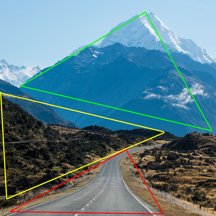
The use of line and shapes can alternately bring stability or tension to an image, both of which create pleasing compositions. Diagonals and triangles bring tensions and dynamism to images, while vertical or horizontal lines can bring stability since our eyes are so used to perceiving this type of line. “The rectangle is the most used shape in the world. That’s why when we see a diagonal, we feel some tension as if we wanted to stabilize it, to prevent it from falling. Simultaneously, it adds volume to the picture. Triangle is a geometric shape that has multiple diagonals and a feeling of perspective hence adding even more dynamism. It is possible to build the entire picture made of triangles, and such an image will look dynamic and lively. ”

The strong vertical lines of the tree bring stability to the photograph.

S-Shaped Curve
Lines don’t always have to be straight. S-shaped curves are a soft, gentle way to lead the viewer’s eye along an image. A naturally occurring shape, the S-curve has been employed by great Renaissance artists and contemporary photographers alike to bring a tranquil, dynamic flow to their work.

Central Composition
Many basic photography guides will tell you never to place your subject in the center and stick to the rule of thirds. But rules are meant to be broken. As Gorlin explains, “You can safely put an object into the center if the photo is about this subject solely and everything else is complimentary. As opposed to other rules, where we try to blend it into the scenery. Take this as a more centrist, egoistic approach. This composition, however, needs some strong composition lines pointing at your subject.”

Radial Composition
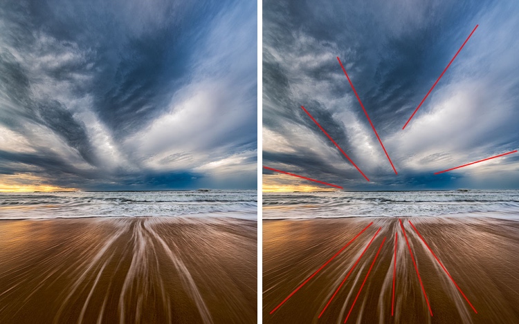
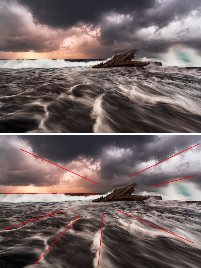
This type of diagonal composition has one main focus with lines that lead toward it. It’s an easy compositional technique that can be quite effective. Think of it like the sun and its rays. To make it the most effective, Gorlin says, “It is essential not to have any other center of gravity or significant lines to make the effect even stronger.”

Negative Space
Filling the frame is one oft-heard compositional concept, but did you know that leaving negative space can also be effective? “We deliberately leave a lot of empty space around our hero to emphasize the feeling of the loneliness or emptiness or The Big Unknown or something similar. Sometimes, such a photograph can also convey a sense of smallness of human. Negative space is the perfect example of breaking the rules tastefully.”

Rule of Odds
This rule plays on the earlier concept of tension and stability by hypothesizing that we tend to view an uneven number of objects in a photo as more pleasing than an even number. “The even number of objects suggests balance and lack of movement and of course, the bigger the number, the harder to spread attention between all subjects. Also, two elements imply competition, opposition, and tension, or just a dialogue. Three elements convey a story and produce a dynamic balance.”

Open area
Block/Unblock Area
It’s important to leaving breathing room around the central object in a photograph in order for it not to feel stuffed in and crowded. This rule uses closed and open space to give a pleasing final result. “Open space allows the flow into infinity; the closed area keeps us inside of the area. The desired effect you want to achieve dictates how you need to compose a shot. Open space is optimistic and encourages us to get out of the current state, to move towards the future. The closed area is stable and dependable, and it prompts to stay and think, to recap.”

Closed area
Learn more about photography composition and get additional tricks and tips in Anton Gorlin’s full guide.
Anton Gorlin: Website | Instagram | Blog
My Modern Met granted permission to use photos by Anton Gorlin.
Related Articles:
Images Reveal How Perfectly Ansel Adams’ Photos Align With the Golden Ratio
Improve Your Photography Skills with These 9 Photo Composition Tips by Steve McCurry
Quick Guide to the Rule of Thirds for Artists and Photographers
Professional Photographer Reveals the Patience Needed to Take the Perfect Photo
