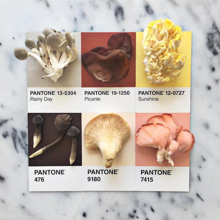
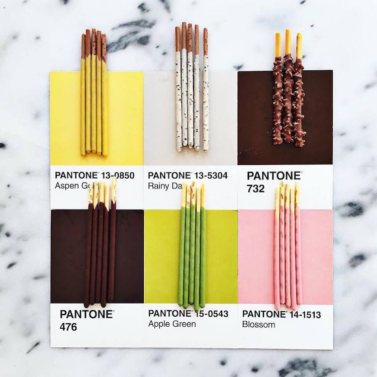
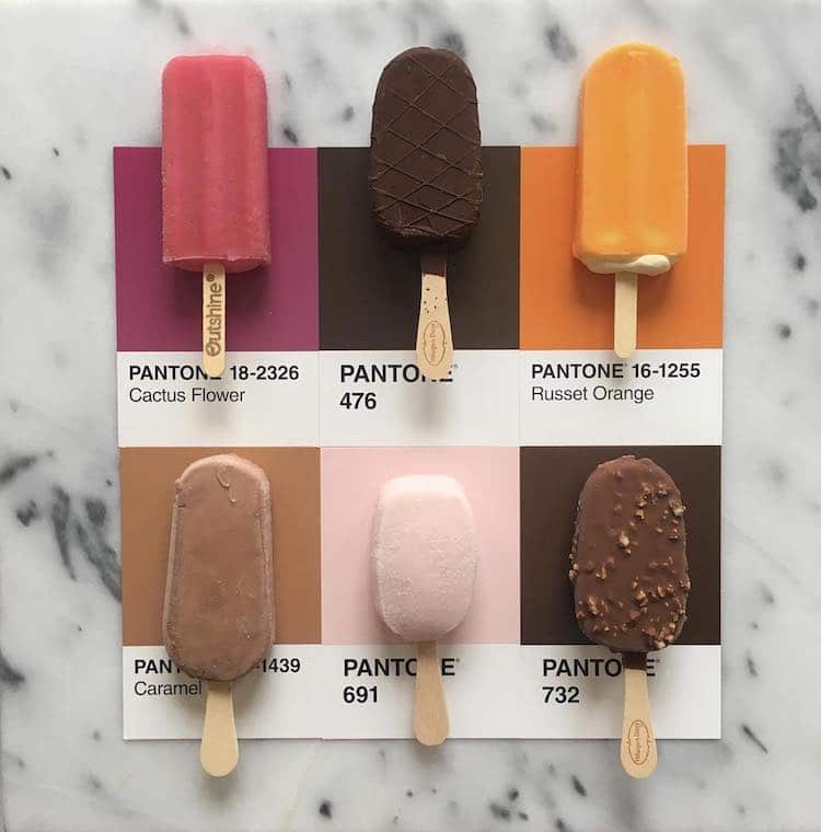
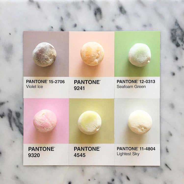
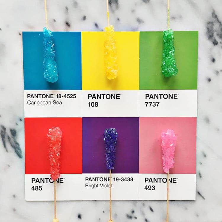
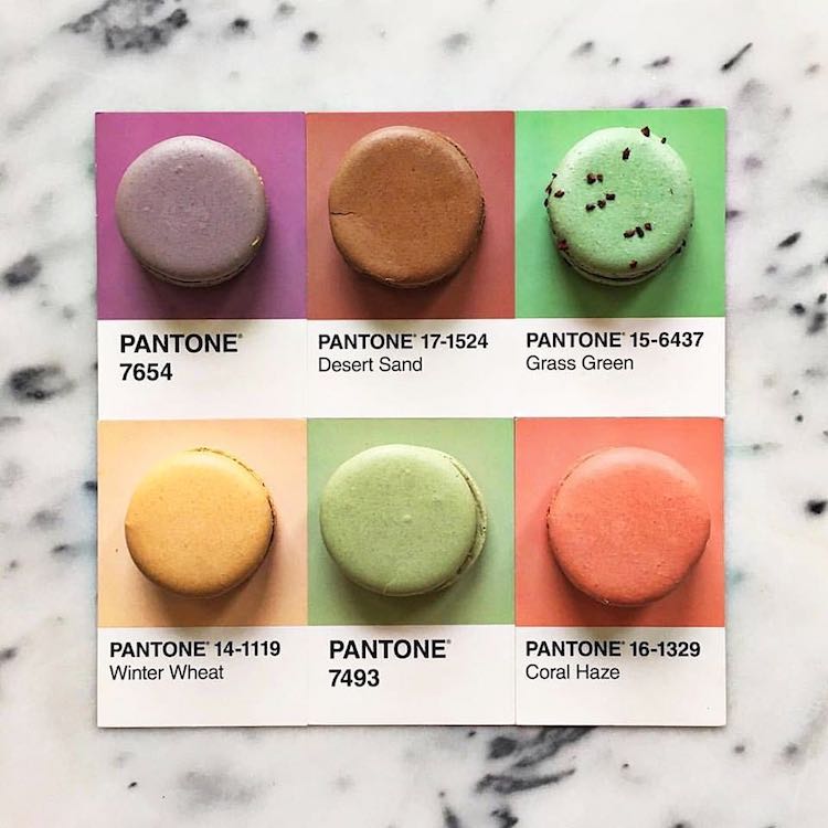
Food and design go together more often than we think. Lucy Litman shows us how both literal and delicious this can be with her #pantoneposts project. The premise is simple yet visually striking—and it’ll probably make you hungry. Using Pantone swatches, Litman matches the colorful squares with foods of the same hue.
Like many creative endeavors, Litman began #pantoneposts as a side project. What started with Fruit Loops cereal (as a way to unwind after “frustrating days” at work) quickly became a way for her to celebrate the beauty of foods found in nature. You might think that vibrant purples and bright corals would be hard to find, but Litman shows that what grows from the ground can be just as brilliantly hued as processed fare.
Working with food runs deep for Litman. “Food has always been what’s inspired me most in my life,” Litman explained to Civil Eats. “My grandparents grew up in farming families, and my favorite memories growing up are planting and harvesting vegetables in their backyard. I was always amazed by nature and the idea that a tiny seed could produce such bountiful and vibrant food … the colors and variety of food continue to amaze me.”
Lucy Litman continues her ongoing Pantone art with food project called #pantoneposts.
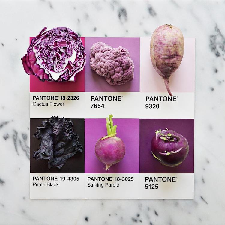
Through it, she matches colorful foods with their corresponding swatch.
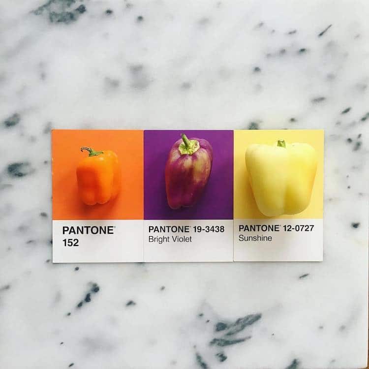
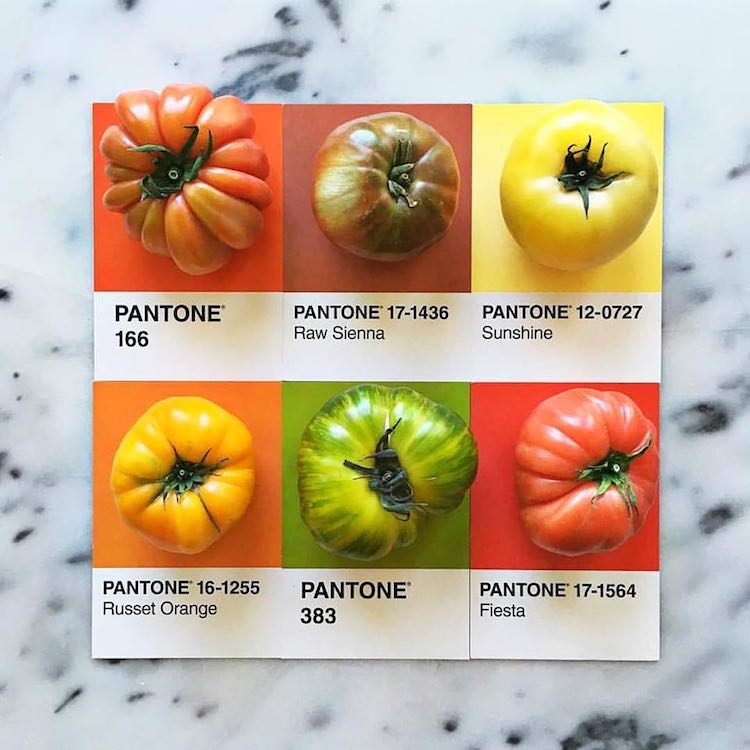
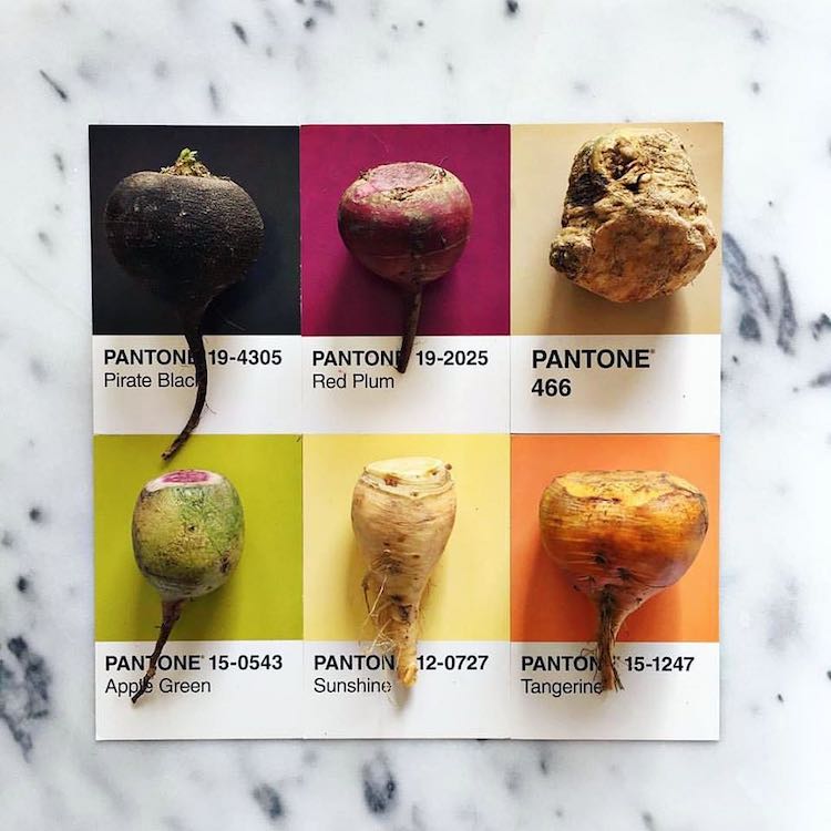
The project demonstrates that things from the nature can be as a colorful as processed fare…
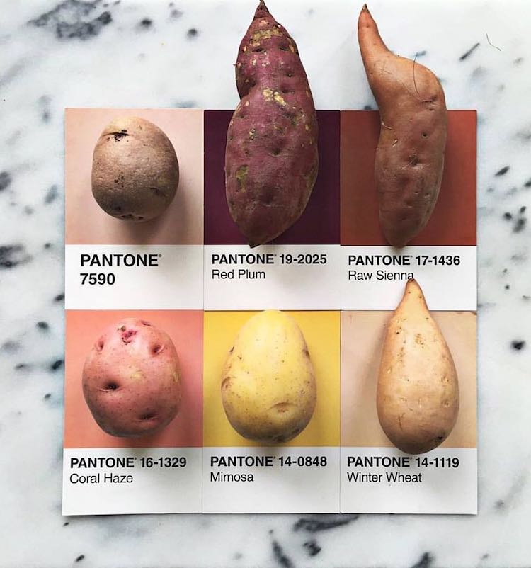
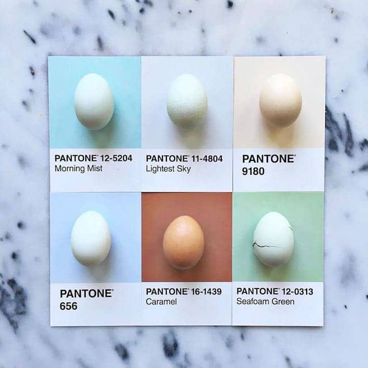
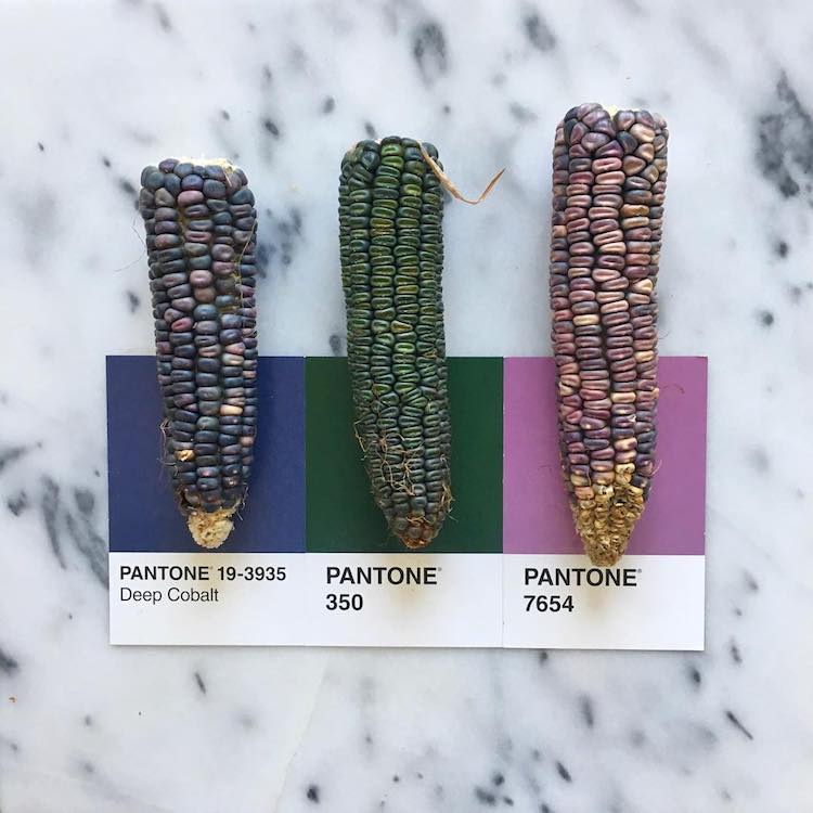
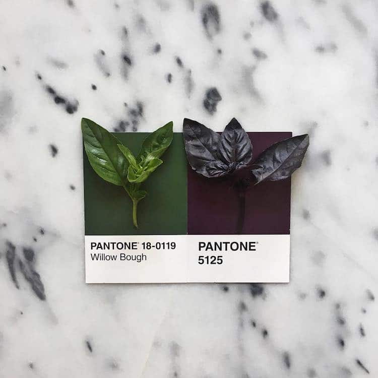
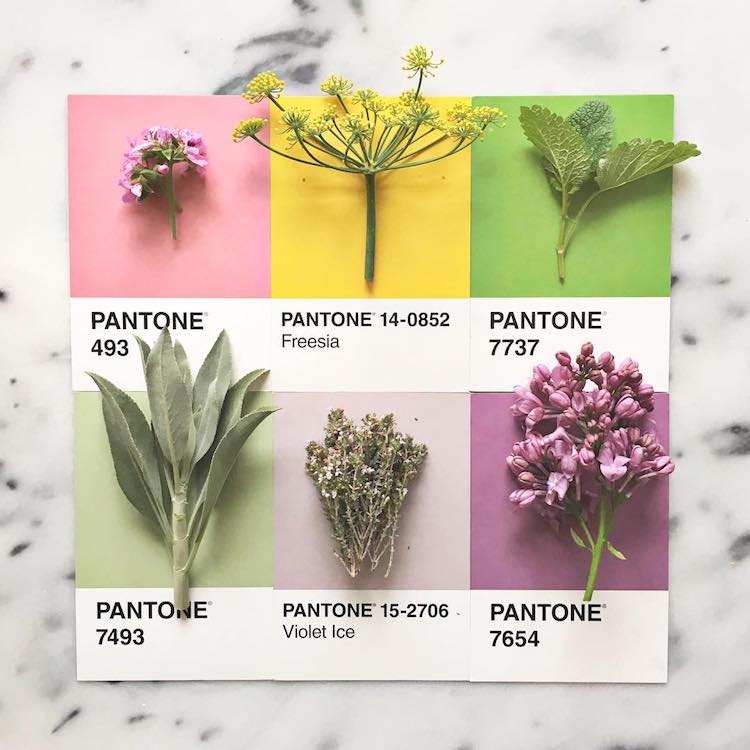
… but she does include that too.
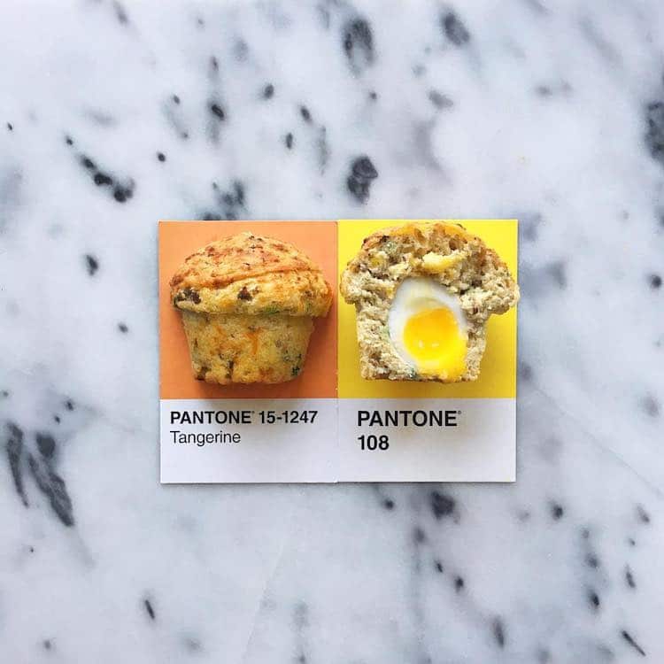
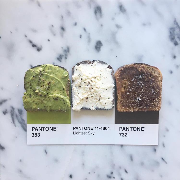
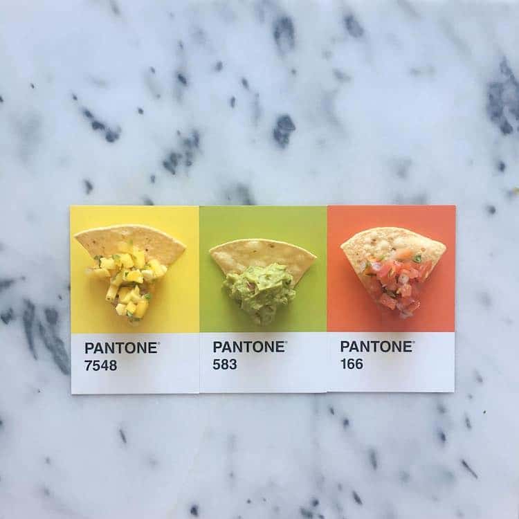
Getting hungry yet?
 Lucy Litman: Website | Instagram
h/t: [Design You Trust]
All images via Lucy Litman.
Related Articles:
Baker Uses Cookies As Confectionary Canvases for Colorful Art
Delightful Pantone Color Dessert Tarts
Intriguing Human Pantone Swatches
