Drew Wallace

Image: Drew Wallace
Another talented artist to integrate typefaces into her illustrations is Drew Wallace. Her typography posters merge iconic motifs with corresponding movie quotes. One great example is an artwork titled The Big Lebowski, in which a bowling pin contains The Dude’s famous words, “Yeah, well you know that’s just like your opinion man.”
Kirill Zaytsev
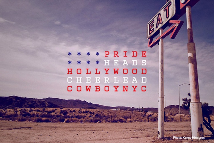
Image: Kirill Zaytsev (CC BY-NC-ND 4.0)
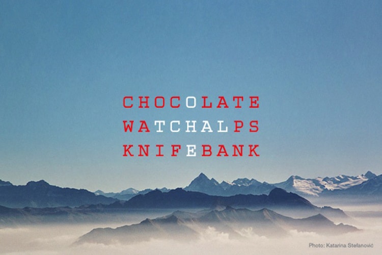
Image: Kirill Zaytsev (CC BY-NC-ND 4.0)
Russian artist Kirill Zaytsev believes every nation can be generalized and narrowed down using various visual and written cliches. His clever Flagsters series captures the viewer’s attention with layers of simple photos and colorful typography designs using just five or six meaningful words. The United States is formed from the words pride, heads, hollywood, cheerlead, cowboy, and NYC. Switzerland includes the words chocolate, watch, Alps, knife, and bank. The artist describes the project as “an experiment with visual forms of national flags using verbal stereotypes.”
Craig Ward
New York-based Craig Ward is known primarily for his pioneering typographic works. His astonishing typographical forms are made through various experiments and collaborations. Rather than work digitally, Ward creates his typefaces using various materials around him. His The Shape of Light series is described as an “exploration into shaping letterforms using just light sources and cuts in surfaces.” In another project, titled You Blow Me Away, Ward collaborated with photographer Jason Tozer—together they fired various objects through a screen-printed piece of glass and photographed the scenes at various stages.
Stefan Sagmeister
New York-based Stefan Sagmeister is well-known for his album cover designs for the likes of The Rolling Stones, OK Go, and Lou Reed. He has developed a strong reputation for producing ingenious typography art through the use of a broad range of approaches. His personal projects include a published book called Things I Have Learned in My Life So Far which includes his real-world typographic compositions named Trying to Look Good Limits My Life.
Guillaume Apollinaire (1880-1918)
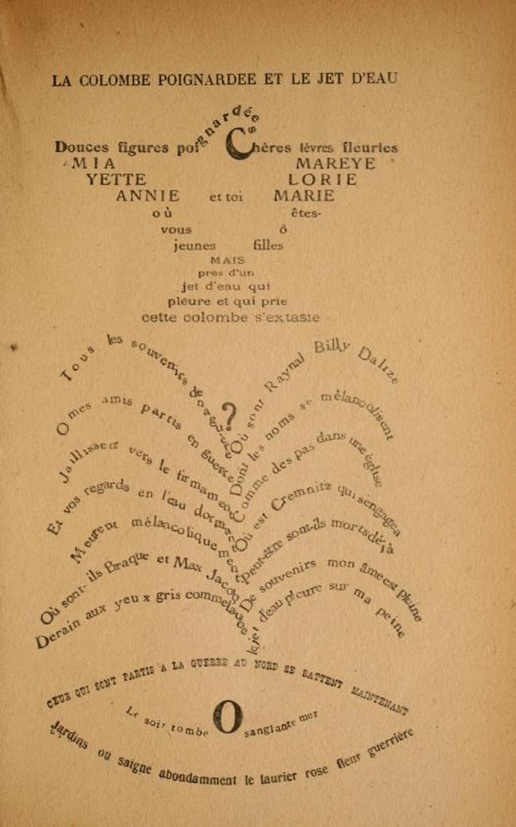
From “Calligrammes; Poems of Peace and War, 1913-1916” by Guillaume Apollinaire, 1918 via The Public Domain Review
Known as “one of the foremost poets of the early 20th century,” Guillaume Apollinaire was one of the first creatives to experiment with text layout. In his book titled Calligrammes: Poems of Peace and War, his poems were printed in unorthodox layouts, taking the shapes of different objects, to give them added visual meaning. Equally a picture and poem, Apollinaire coined the term ideogram.