Since making its colorful debut in the 1950s, Pop Art has remained a prominent artistic movement. Thanks to the innovations of well-known masters like Andy Warhol, David Hockey, and Keith Haring, the one-of-a-kind genre marked the end of modernism and celebrated the onset of contemporary art.
Key pieces of Pop Art helped to facilitate this significant shift in artistic sensibilities. From Richard Hamilton’s unconventional collage that sparked the movement to Roy Lichtenstein’s most iconic comic book adaptation, these experimental masterpieces prove that popular culture is more than meets the eye.
What is Pop Art?
Pop Art is a distinctive genre of art that first “popped” up in post-war Britain and America. Primarily characterized by an interest in popular culture and imaginative interpretations of commercial products, the movement ushered in a new and accessible approach to art. Ranging from quirky to critical, the pieces produced by Pop artists in the 1950s and 1960s commented on contemporaneous life and events.
In addition to the unique iconography itself, the artists’ treatment of the subject matter helps to define the genre. Renowned for its bold imagery, bright color palette, and repetitive approach inspired by mass production, the movement is celebrated for its unique and recognizable style.
Key Works
Richard Hamilton, Just what is it that makes today’s homes so different, so appealing? (1956)
Created in 1956, this collage is considered the catalyst for Pop Art’s proliferation in the United Kingdom. British artist Richard Hamilton crafted it for This is Tomorrow, a special exhibition at London’s Whitechapel Art Gallery that presented contemporary artists’ interpretations of modernity and their predictions for the future.
Just what is it that makes today’s homes so different, so appealing? incorporates several communication-related themes preemptively brainstormed by Hamilton. These include: “Man, Woman, Food, History, Newspapers, Cinema, Domestic Appliances, Cars, Space, Comics, TV, Telephone, Information.” Using clippings from American magazines, he created a scene based on these motifs, literally crafting a work of art from pieces of popular culture and commenting on “the various influences that were beginning to shape post-war Britain.”
Andy Warhol, 32 Soup Cans (1962)
In 1962, American artist Andy Warhol first explored his well-known “soup can” motif. 32 Soup Cans is composed of 32 hand-painted and hand-stamped canvases, each depicting a different flavor of Campbell’s Soup. Warhol, a pioneering pop artist, chose this subject matter because it captured Pop Art’s focus on mass production and his own artistic interest in repetition. “I used to drink it. I used to have the same lunch every day, for 20 years, I guess, the same thing over and over again.”
Soon after painting this collection of canvases, Warhol would continue to experiment with the soup can motif and with the idea of multiples. However, with these later works, he shifted his process from painting to silk-screening, a method of printmaking fittingly used in the commercial production of advertisements.
Roy Lichtenstein, Whaam! (1963)
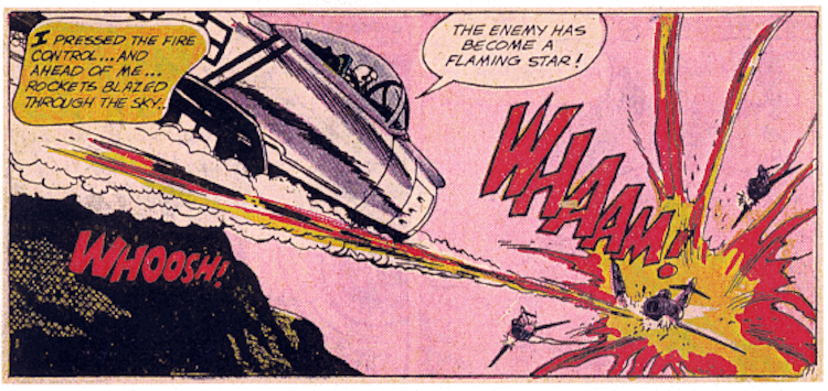
Known for his colorful, comic-book-inspired paintings, artist Roy Lichtenstein put an animated and energetic spin on Pop Art. Whaam!, one of his most well-known compositions, adapts a scene from All American Men of War, a popular series published by DC comics from 1956 to 1966.

Original panel by Irv Novick for DC Comics’ ‘All-American Men of War,’ No. 89 (Feb. 1962)
Reminiscent of an open comic book, Whaam! is rendered on 2 panels. On the left side of the diptych, an aircraft shoots another plane, which—along with the exclamation “WHAAM!”—takes up the entire right side of the piece. While the composition is strikingly similar to the original depiction, Lichtenstein changed several details: he altered the aircrafts’ designs, omitted a speech bubble, and changed the color scheme.
These small changes speak to Lichtenstein’s larger objective, which was to personalize these mass-produced works of art. “I don’t draw a picture in order to reproduce it—I do it in order to recompose it,” he explained. “I go all the way from having my drawing almost like the original to making it up altogether.”
Robert Raucshenberg, Retroactive II (1964)
Renowned for his unique approach to materials, Robert Rauschenberg contributed to the Pop Art movement with his Combines and collages. One particularly memorable pop culture-inspired piece is Retroactive II, a silkscreen painting created in 1964.
Reminiscent of a collage, Retroactive II features important imagery from the period, including a portrait of John F. Kennedy and a NASA astronaut. In addition to this current events-inspired iconography, the piece’s busy composition, photographic inspiration, and artificial color palette perfectly capture the Pop Art aesthetic.
David Hockney, A Bigger Splash (1967)
In the second half of the 1960s, British artist David Hockney revisited a unique subject in his popular culture-inspired paintings: the swimming pool. Inspired by a trip to California, he enjoyed the clean lines, modern aesthetic, and suburban popularity of the fixtures.
In the spring of 1967, he completed his most well-known pool painting: A Bigger Splash. Featuring only a modernist home, a folding chair, and 2 palm trees in the background, the piece’s focal point is the pool. A simplistic diving board hovers above the sleek surface of the water, which is obstructed by a splash. This subject matter, along with the color palette and graphic aesthetic of the composition, evoke the interests explored by Hockey and his fellow Pop artists during the period.
Claes Oldenburg Coosje van Bruggen, Spoonbridge and Cherry (1985-1988)
Pop Art pair Claes Oldenburg and Coosje van Bruggen are celebrated for their oversized outdoor sculptures. Among their most famous work is Spoonbridge and Cherry, a (much) larger-than-life depiction of a shiny red cherry balancing on the bowl of a stylized spoon.
Located in the Walker Art Center’s Minneapolis Sculpture Garden, this sculpture puts an artistic twist on seemingly ordinary objects. By playing with scale and choosing such simple subjects, Oldenburg and van Bruggen turn mass-produced objects into a quirky work of art.
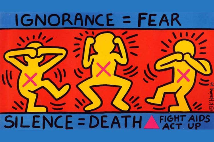
Keith Haring, Ignorance = Fear (1989)

Photo: Keith Haring Foundation
Keith Haring was an American artist and social activist renowned for his colorful contributions to New York City’s 1980s street culture. He combined Pop Art with graffiti, making the former even more accessible—and unavoidable—to the public.
One piece that captures his activist-inspired approach to art is Ignorance = Fear, a poster produced in 1989. Haring designed and created this poster for the AIDS Coalition to Unleash Power (ACT UP), an organization based in New York. By modernizing the age-old mantra of “see no evil, hear no evil, speak no evil,” Haring comments on the dangers of silence during the AIDS epidemic. Though serious in subject matter, the poster is rendered in bold tones and a graphic aesthetic, proving the adaptability and endless possibilties of Pop Art.
