PHOTOGRAPHY BY MEGHAN MCNEER
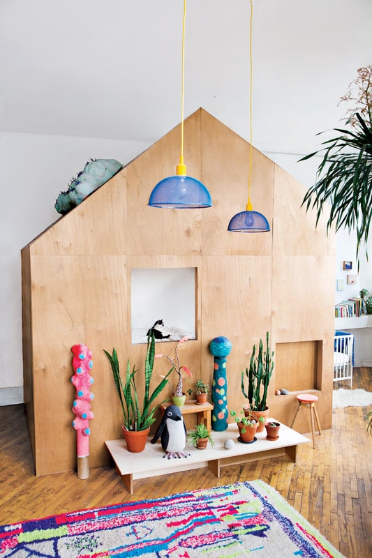
If you have yet to hear, stacks are the latest trend to hit the design world by storm. But, we’re not talking about just any regular stack. Thoughtfully formed, beautifully curated, and color-coordinated with flawless execution, it has come to be known as the totem trend, one that has been gaining serious traction within the recent year. A product of the recent resurgence of the maximalist movement, the onset of totem-inspired items has permeated the design world to great acclaim.
The trend presents itself in a myriad of iterations, proving the versatile nature of the look. Terri Chiao and Adam Frezza of Chiaozza—tour their dreamy Brooklyn home here—are among the long list of designers whose collections feature at least one totem-inspired object or another. Ahead, a look at a few of our favorite renditions of this Insta-famous trend.
PHOTOGRAPHY BY CHARLIE SCHUCK FOR MOVING MOUNTAINS DESIGN STUDIO
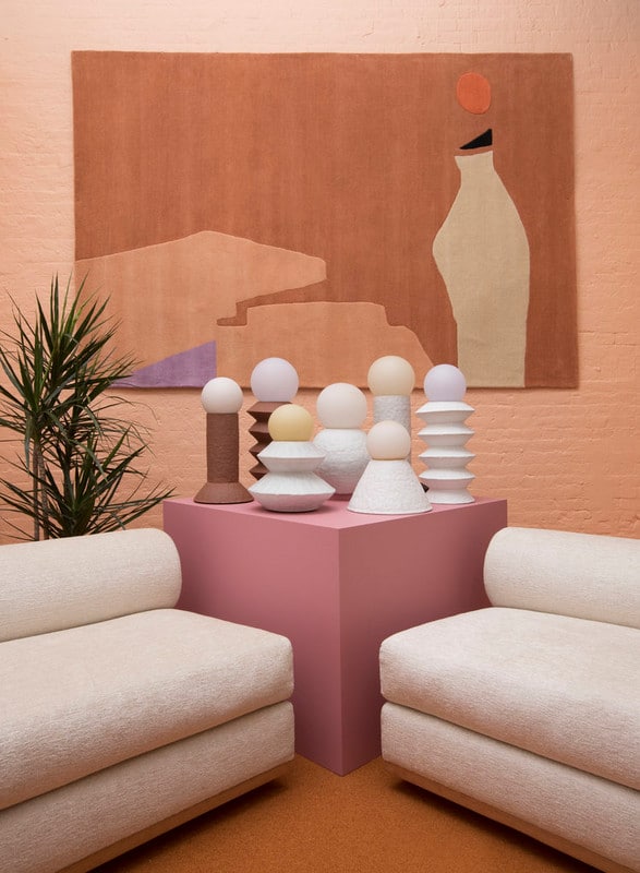
Having just debuted at the Sight Unseen OFFSITE, Moving Mountains Design Studio‘s latest collaboration comes in the form of a new lighting line, together with ceramicist, Giselle Hicks. The modernized iteration of the totem design trend embraces a neutral palette, albeit it’s one that certainly does not compromise on character or style. Form and function combine, resulting in an effortlessly cool and elegant accent piece.
PHOTOGRAPHY BY SHAKER DESIGN PROJECT
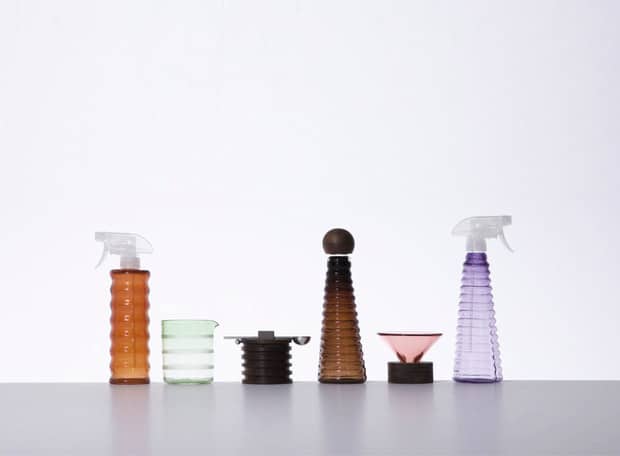
Ready to take on the trend with a more utilitarian approach? Fresh from NY Design Week, Design Within Reach’s Furnishing Utopia 3.0 installation brought on an array of reimagined household basics, each embodying the trend in one unique approach or another. The theme of the exhibit may have been “chores” but there was nothing snoozy or routine when it came to this lot. Clad by a refreshing palette and streamlined build, every one of the elevated tools was recreated with an innovative perspective.
PHOTOGRAPHY BY KARTELL VIA DEZEEN
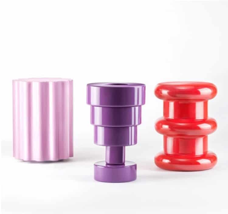
We’re always here for a little change, especially when said change comes in the form of a decor staple. From Italian brand Kartell, comes a collection of items originally designed by the famed Ettore Sottsass, featuring stools and vases, all clad in a vibrant array of saturated hues. The totem-inspired build of the pieces pay tribute to the trend all the while channeling the ’80s vibe of the Italian design studio.
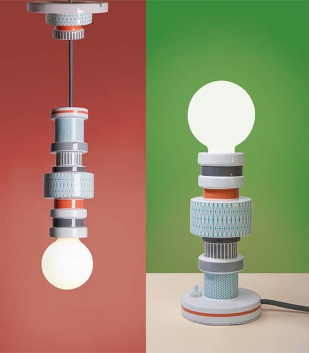
PHOTOGRAPHY BY SELETTI
Seletti’s quirky take on the traditional scope of interior essentials don’t come sans a major touch of color or whimsy, and these versatile pendants are no exception. Emulating the trend’s stackable nature, the lights of the Moresque collection possess the vibrant tonal and pattern pairings the trend is known for, offset by the delicate nature of the piece’s porcelain build.
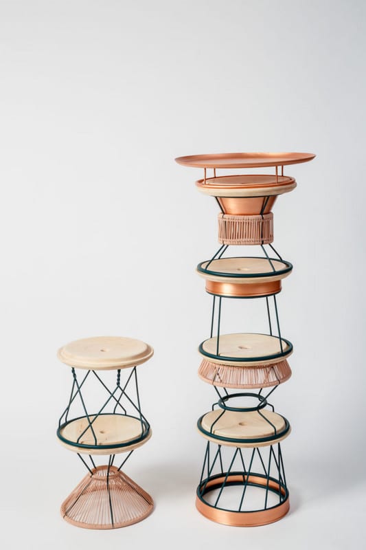
PHOTOGRAPHY BY NIMROD GANISHER
The Yemenite Totem by designer Shir Avraham sources is inspiration from the ancient Jewish Yemenites and is comprised of four individual pieces including a side table, stool, and tray table. Its mixed media composition provides a modern refresh on the classic ’80s concept, accentuated by the lustrous brass detailing and woven textures.
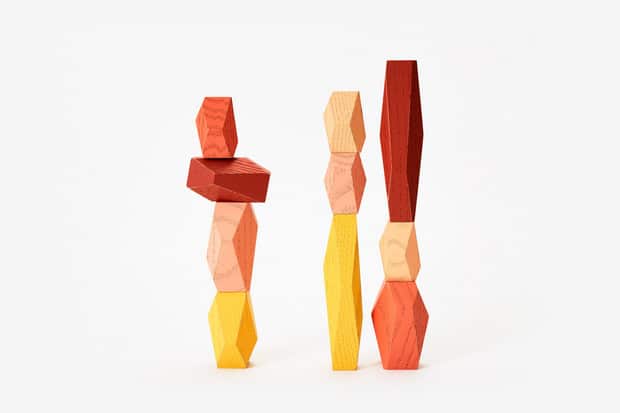
PHOTOGRAPHY BY FORT STANDARD
A decorative accessory with a DIY component is one we can definitely get behind, especially when it comes with the added challenge of a Jenga-like stacking strategy. Fort Standard’s take on the trend features a vibrant slew of saturated tones, which will impart your space with a bold pop of color.
Balancing Blocks, Fort Standard, $48

PHOTOGRAPHY BY KELLY WEARSTLER
Kelly Wearstler’s Tephra Totem brings on a major dose of character and style. The dynamic sculpture, crafted of oak, bears a striking geometric detail, which is further elevated by the ebonized finish. An undeniable splurge, the towering structure invites plenty of drama and yet manages to maintain a stylistically minimalist aura all the same.
This story was originally published on Domino.
Related Articles:
Interview: People Are “Hacking” IKEA Products into One-Of-A-Kind Decor
25+ Creative Bookcases That Add a Modern Twist to Interior Design
10 Essential Skills Every Interior Designer Needs to Have
Stunning Interior Perfectly Divided into a Half-Graffitied Room
