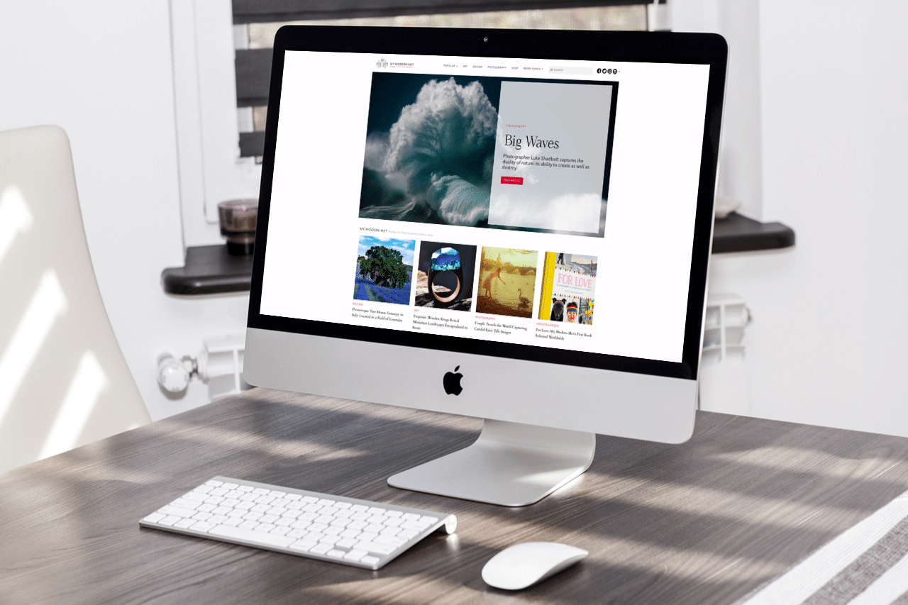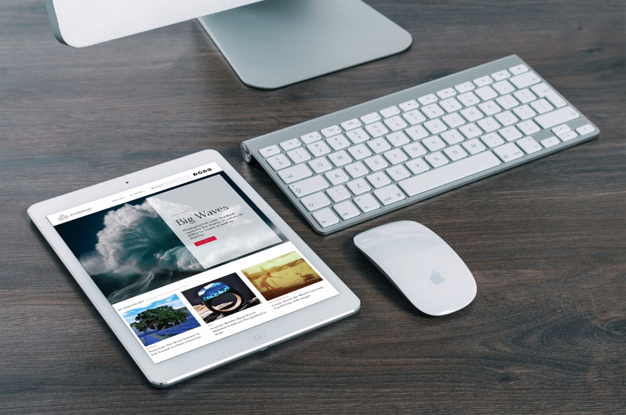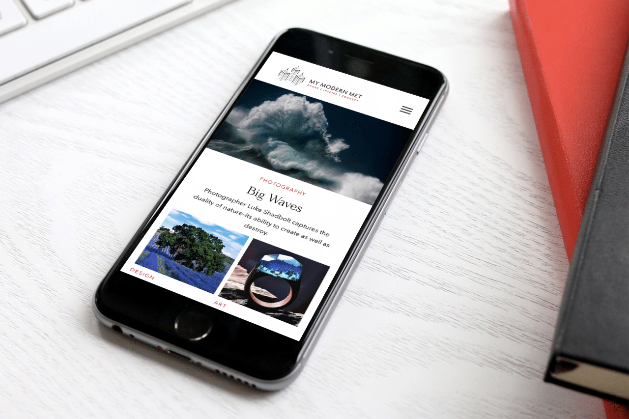
As some of you may have noticed already, we’ve made some big changes here at My Modern Met. Over the past few years, we realized that we were long overdue for a redesign. As the stars finally started to align, we began the process about a year ago and it’s our pleasure to share it with you today.
Our first major objective was switching platforms. We’re very appreciative of how far our old platform took us, but we knew that it was only a matter of time before we would need to switch to WordPress. As one of the largest platforms around, this provides us with much more design and development flexibility, and also allows us to optimize the site more efficiently, especially with things like speed.

Another major objective was improving user experience on mobile, which is how the majority of our audience is reaching us now. I’m happy to say that our site is finally mobile responsive, which allows readers to view our content more easily, without having to squint or zoom in.
Last but not least, we worked tirelessly to improve the overall design of the site, keeping some aspects of the original design, but making it cleaner and sleeker, particularly with the layout and fonts. We also paid close attention to social sharing, so that our content could be more easily shared with friends and family.

I’d like to sincerely thank our design/development partners over at Electric Pulp. Your creative vision, technical expertise, professionalism, and patience was crucial throughout the entire project. I’d also like to thank our Design Director, Annie Lee Kim, who led our design team internally, created countless mockups and played a pivotal role with our mobile design. And finally, thanks to our wonderful editorial team, Pinar Noorata, Sara Barnes, Jessica Stewart, and Kelly Richman-Abdou for your meaningful contributions, and for being super patient as we made this transition.
We started My Modern Met over eight years ago with a mission to create a big city that celebrates creative ideas. That dream not only exists today, but our team believes in it more than ever. We see this redesign as a visual statement of intent. We understand that more work will always need to be done to improve your experience, and we intend to push forward with this in mind. Thank you so much for following us throughout the years.
We’d love to hear your feedback, whether it be positive or constructive. Please email us with your comments. Thanks!
All the best,
Eugene Kim
Co-Founder & Editor-in-Chief, My Modern Met
