Whether you’re working in a creative industry or are aspiring to be in one, sites like Creative Boom will help you in your journey. Founded in 2009 by Katy Cowan, the blog offers something for everyone who makes art, design, or photography a way of life.
Creative Boom features a wealth of visual inspiration from makers around the world. In any given week, you might read an article about giant woodcuts, bespoke ping pong paddles, and rare photographs of Prince. With this wide-ranging source of inspiration, the site champions a multi-disciplinary approach to artistic influence. By being exposed to different media and processes, it challenges us to consider how we utilize materials in our own work.
In addition to writing about and promoting creatives, the site also offers practical advice on how to start or grow your career. It is a trove of resources, including tips on making it as a freelancer, maintaining a work/life balance, and getting over your creative block. No matter where you are in your career, their advice is sure to strike a chord.
We were honored to speak to Katy about Creative Boom—a site which we have personally admired for many years. Learn more about her background and its playful redesign that takes their branding to the next level.
We spoke to Katy Cowan of Creative Boom, one of the best art blogs around.
Scroll down to learn about the site and hear creative career advice from Katy!
 What is your background? What led you to become the Founding Editor of Creative Boom?
I’m a journalist and PR consultant from Manchester, UK. I launched my own PR firm in 2007 and spent a happy two years freelancing for various clients. But then the global recession happened and myself and many of my freelancer friends on Twitter were suffering. I decided to put my skills to good use and launch my own online magazine, calling it Creative Boom with the intention to support the creative industries—helping others to get noticed and win new business. It was immediately well received and has since grown to attract half a million monthly readers. And my PR agency, Boomerang, has benefited enormously, with clients today including BBC and Manchester City Football Club.
 How has Creative Boom evolved over the years?
It started out with lots of different features and sections, many of which are no longer. Back then, I could experiment to see what our audience preferred. It was lots of fun. Creative Boom has therefore evolved organically, and today’s version is the result of plenty of trial and error. I feel like it’s matured in recent years. It’s become a whole lot more sophisticated and we’re now attracting big-name designers and brands who know about us and want to be featured. We’ve always had our inspiration and tips sections—these have been consistently popular. Our current structure is working well, but I’m still open to trying new things.
How has blogging itself—particularly art blogging—changed since you started in 2009?
Back in 2009, social media wasn’t so focused on ad revenues, so it was easier to build audiences and reach them. Today, social media is making it more difficult to engage with organically-grown audiences without having to pay for it. I get it. But it is frustrating, as I know how hard I worked in those early days to naturally build followers and raise our profile. However, what has changed in recent years is that people are sharing content much more than they used to. Just one of our articles generated over 264,000 shares across multiple platforms. There are many more places to share content too, so we don’t have to rely on social media as much anymore. It’s great to see Creative Boom reaching more people.
 How do you curate content for Creative Boom—do you have a philosophy or guiding principle behind what you feature? What are some of your favorite places to look for great art, photography, and more?
We’re lucky that we get lots of great submissions from artists and designers, as well as press releases from big brands, galleries, and creative organizations, that we don’t always need to go out and find stuff to write about. We still scour Instagram and Behance to find fresh talent, and we may approach people on that basis. We might spot a great piece of work on another art and design blog, like My Modern Met, and approach the creative in question, asking if we may also feature them. We also try and visit as many events and exhibitions as possible to keep an eye on the creative industries and ensure we’re not missing anything important. How we choose people to feature is simply based on what inspires us, and what we know our audience will love.
What are your favorite tips for someone looking to break into the creative world?
Don’t expect success overnight; you have to roll up your sleeves and be prepared to work very hard. You also have to become the publisher of your own story and learn how to share yourself engagingly with others. It’s also important to have balance – downtime is just as crucial as being at your desk. And if you’re worried about making mistakes—don’t be; there are great lessons to be learned from difficult times.
 What’s one of the most memorable articles you’ve written, and what was so memorable about it?
We’ve always aimed to celebrate, inspire, and support the creative community and part of that comes from sharing tips and advice. A recent favorite article is 10 years of working for myself: The surprising things no one tells you about freelancing. It’s very personal, as it focuses on my own journey. Like everyone, I’ve made plenty of mistakes and learned a lot from running my own businesses. This article doesn’t share everything, but it gives a flavor of my experience. I just hope it helps someone else.
 What prompted the redesign of Creative Boom, and what’s your favorite part of the site?
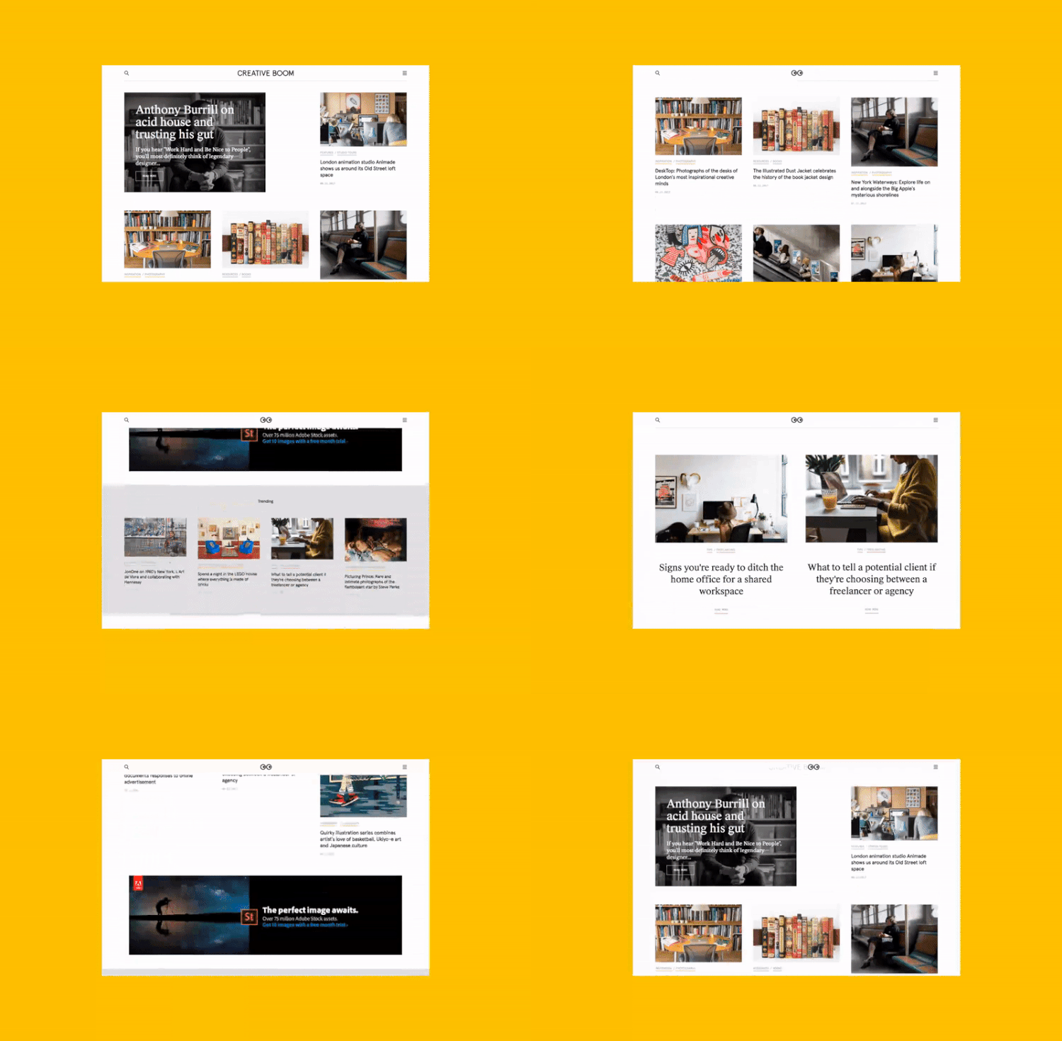
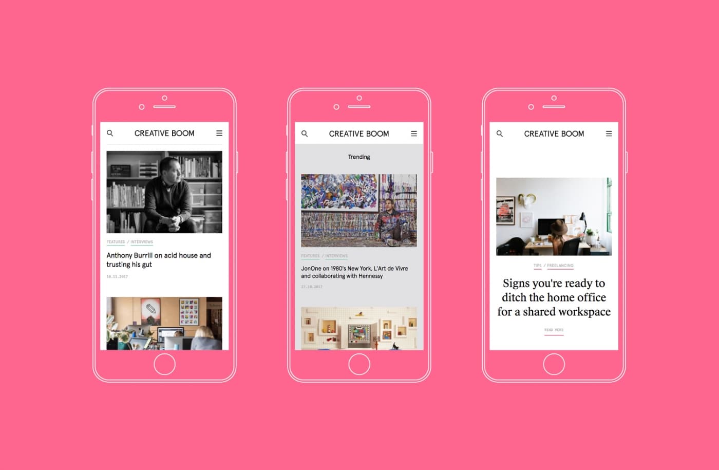
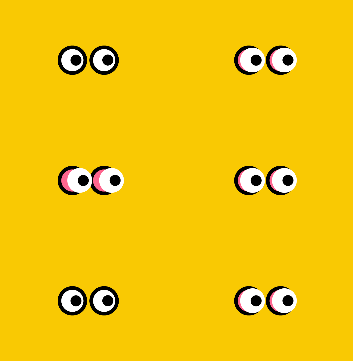
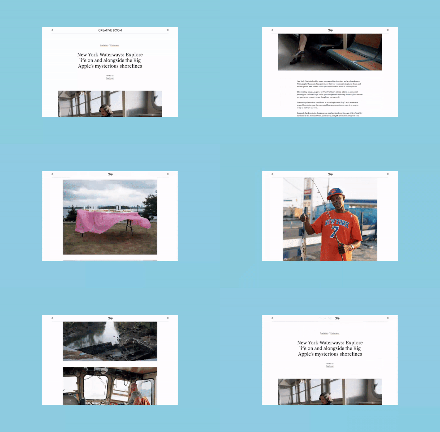
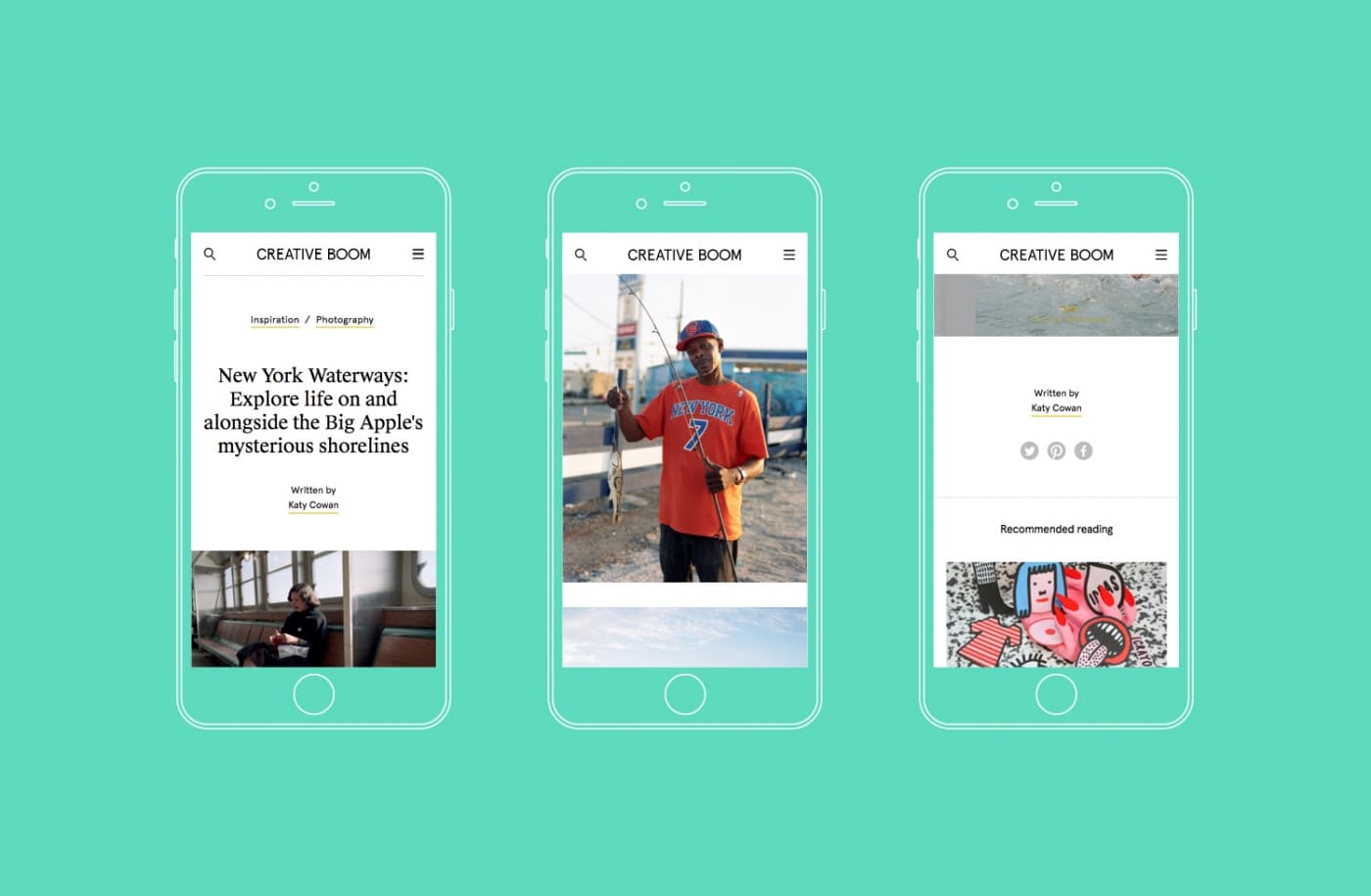
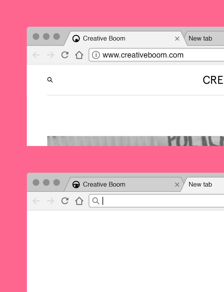
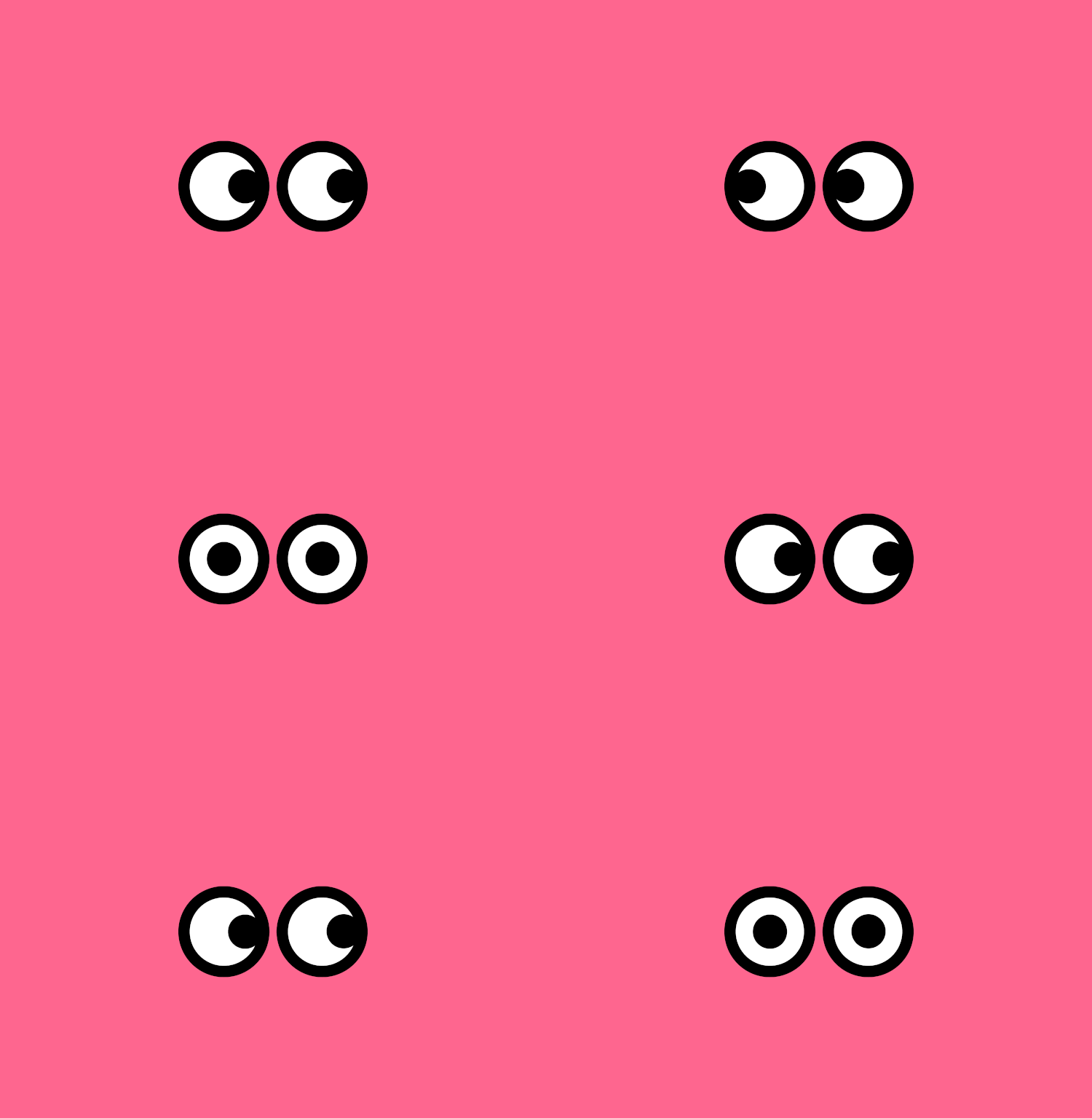
Creative Boom has had its best year to date. Our audience continues to grow and so we felt it was time to address our branding. And, truthfully, it was starting to look a little tired and didn’t really reflect who we are. We’ve always been friendly, fun, and approachable, so we wanted to add this personality to our existing identity. We worked with our designer Samantha Wilkinson to come up with a fresh typography, color palette, and layout along with a cheeky ‘eyes’ icon that follows your mouse cursor around the screen.
I really love the typography, little splashes of color and how we’ve not been afraid of white space. It feels really clean and easy to navigate. And our ‘eyes’ icon has become a fun mascot that has plenty in store for him, starting with a festive interpretation in the run-up to Christmas. I’m so excited and happy to see Creative Boom start a new chapter.
So are we!
Head over to Creative Boom to see the website’s new design in action.
 Creative Boom: Website | Facebook | Instagram
My Modern Met granted permission to use images by Katy Cowan.
Related Articles:
30+ Most Creative Business Cards That Are Sure to Get Noticed
Creative People Share What They Wish They’d Known at Every Age
5 Mistakes to Avoid When Starting a Freelance Business
