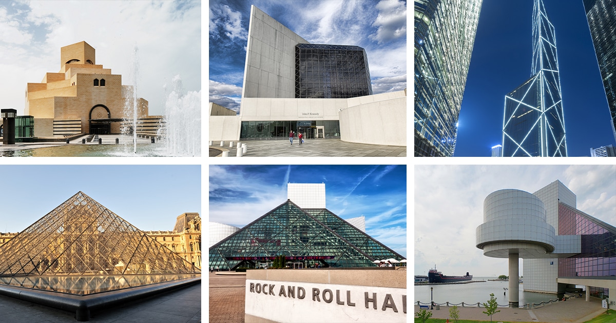
From left to right: Museum of Islamic Art, John F. Kennedy Presidential Library and Museum, Bank of China Tower, Le Grand Louvre Pyramid, Rock & Roll Hall of Fame
Chinese American architect Ieoh Ming Pei, better known as I.M. Pei, was a world-renowned modernist and designer of many influential buildings.
In his early life, Pei was inspired by the gardens of Suzhou and by his time in Shanghai. After moving to the United States and pursuing architecture in university, Pei was disheartened by the Beaux-Arts style popular at the time and briefly turned to engineering. He soon was reintroduced to architecture after discovering a love for modernism. Though his classes taught the Beaux-Arts style, Pei continued to enhance his design skills by learning from masters like Le Corbusier and occasionally Frank Lloyd Wright.
Pei’s most influential projects include the contemporary steel and glass pyramid addition to the Louvre Museum, the John. F. Kennedy Library, Bank of China Tower, and many more. Throughout his career, Pei faced racism for his Chinese heritage, controversy in the face of his forward-looking design work, and finally admiration for his modernist masterpieces. He was awarded the Pritzker Prize for his work in 1983, arguably the most distinguished award an architect can receive.
Read on to see five of our favorite projects by I.M. Pei and to test how many iconic works you recognize!
Here are five incredible projects by I.M. Pei.
John F. Kennedy Presidential Library and Museum
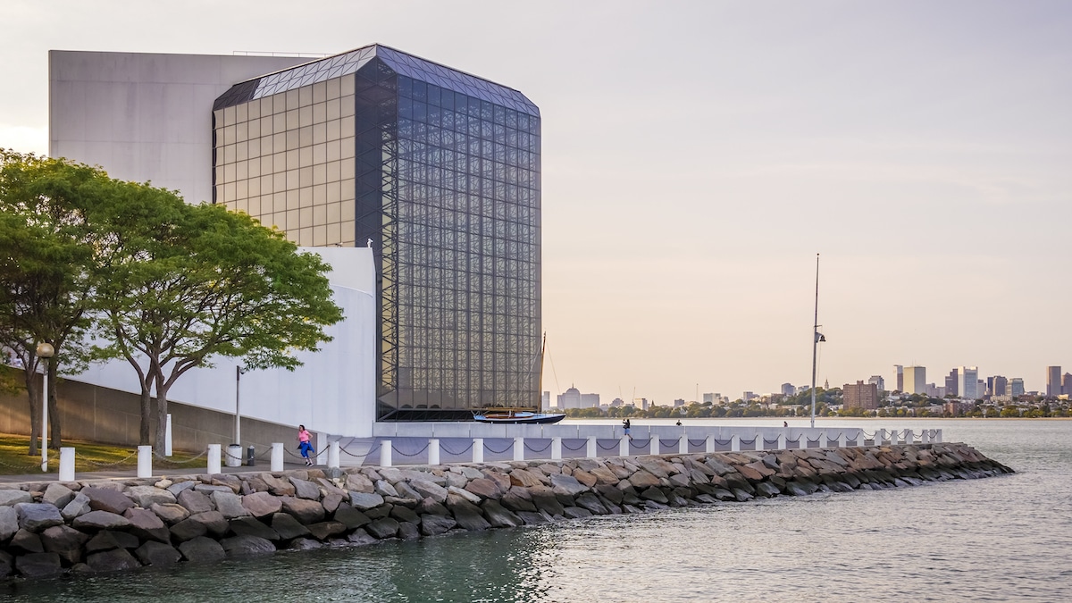
John F. Kennedy Presidential Library and Museum in Boston, Massachusetts, U.S. (Photo: Stock Photos from Marcio Jose Bastos Silva/Shutterstock)
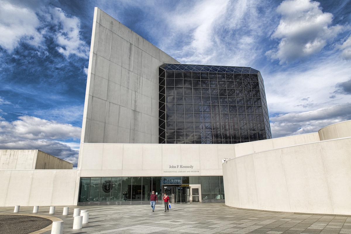
John F. Kennedy Presidential Library and Museum in Boston, Massachusetts, U.S. (Photo: Stock Photos from Marcio Jose Bastos Silva/Shutterstock)
When Pei was selected for the John F. Kennedy Presidential Library and Museum, he was a small name compared to the star-studded list of candidates. He was selected, in part, for the impression he made on Mrs. Kennedy.
Mrs. Kennedy explained that she felt he would be fun to work with and that he was “so full of promise, like Jack.” Aside from liking Pei as a person, she also appreciated the qualities of his design that can probably be attributed to his modernist ideals. “He didn’t seem to have just one way to solve a problem,” she described. “He seemed to approach each commission thinking only of it and then develop a way to make something beautiful.”
The design for the project includes a large concrete tower in contrast to a glass pavilion that houses the museum. These simple geometries were carefully designed to organize the internal circulation and program. They were also thoughtfully considered in reference to the large open site which overlooks the water.
Le Grand Louvre Pyramid
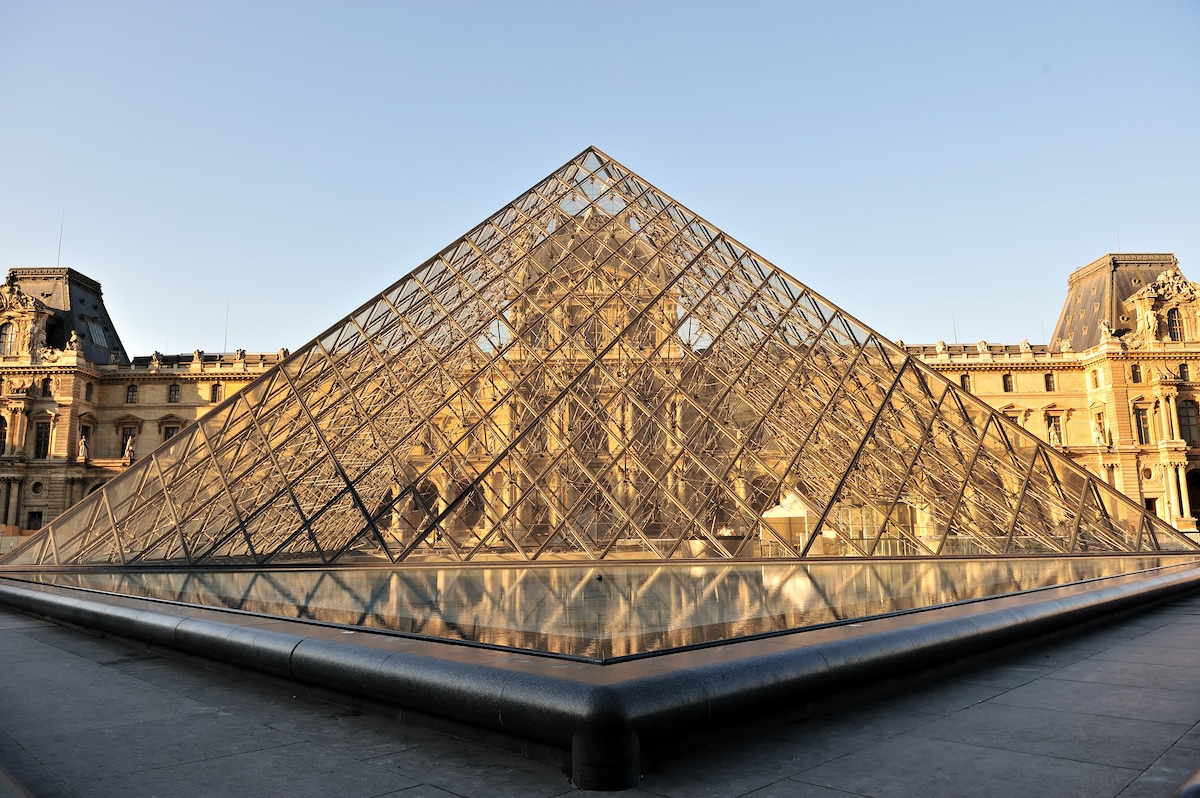
Le Grand Louvre in Paris, France (Photo: Stock Photos from Zoran Karapancev/Shutterstock)
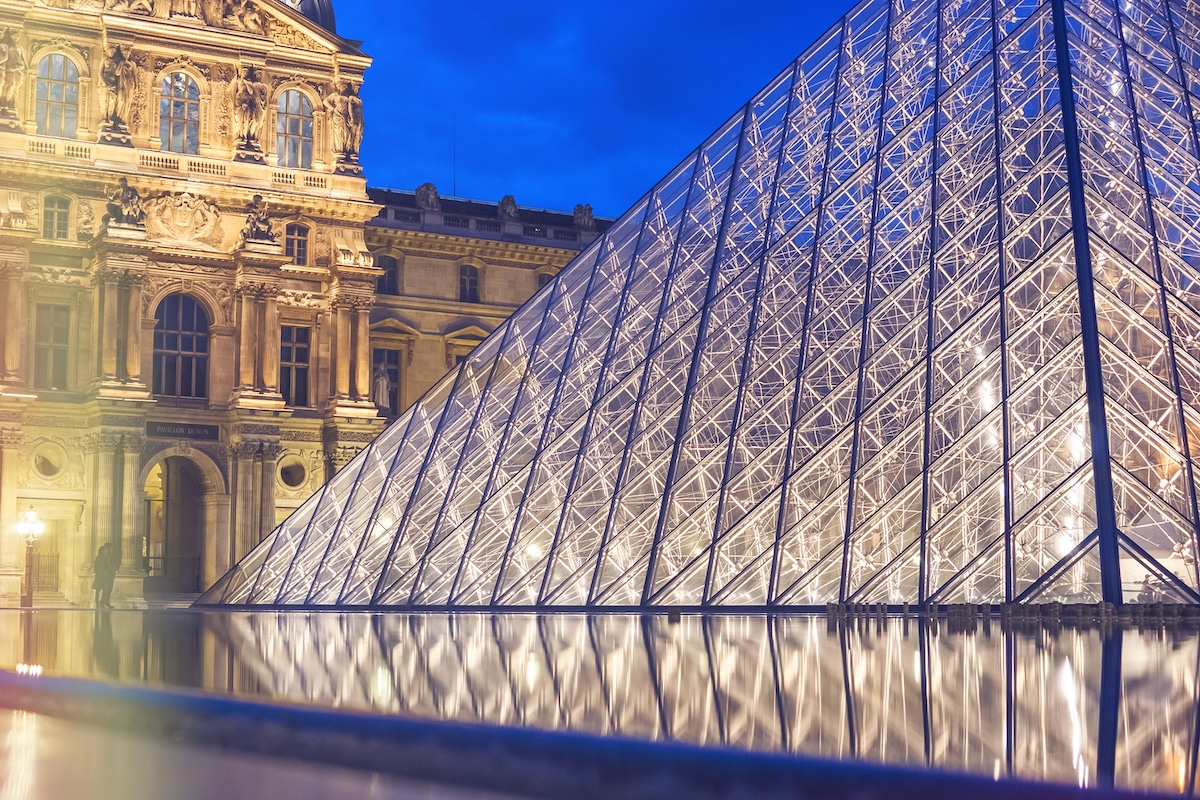
Le Grand Louvre in Paris, France (Photo: Stock Photos from Sergei25/Shutterstock)
At the time of its design, the Louvre Pyramid was extremely controversial. Critics believed that Pei’s modernist pyramid was too starkly in contrast to the classic French Renaissance architecture of the original museum. Other critics claimed that the symbolism of a pyramid simply did not fit in the context since “it makes you think of Egypt.” Despite these criticisms and the harsh racist media campaign that followed its construction, most visitors today would agree that the Louvre Pyramid is a fittingly grand entrance to the largest museum in the world.
Pei explained that the design did not necessarily need to be a pyramid, it simply needed to be a simple, large geometry that brought in light and air while creating a grand entry. He believed that the pyramid did exactly that. The iconic form now serves to organize the public space and resolved the small and awkward entrances from the past. It also reconnected the wings of the museum in logical and concise ways that transformed the viewing experience. Best of all, it acts as an incredibly beautiful structure that perfectly pairs with but does not compete with the surrounding French Renaissance architecture.
Bank of China Tower

Bank of China Tower in Hong Kong (Photo: Stock Photos from Lee Yiu Tung/Shutterstock)

Bank of China Tower in Hong Kong (Photo: Stock Photos from Thitisan/Shutterstock)
Though Pei was trained as an architect in the United States, he was fiercely proud of his Chinese heritage. “I feel China is in my blood no matter where I live,” described Pei. “China is my root.” So it is only fitting to include the Bank of China as one of his most influential works.
The building is the fourth tallest building in Hong Kong at an impressive height of 315 meters (1,033.5 feet). It is also a very recognizable building on Hong Kong’s skyline thanks to the distinctive triangular framework that breaks up the curtainwall system. This project also dealt with some criticism since it breaks common rules of feng shui by including harsh lines and the symbolism of the letter “x.” Still, some appreciate its unique character and massing.
Rock & Roll Hall of Fame
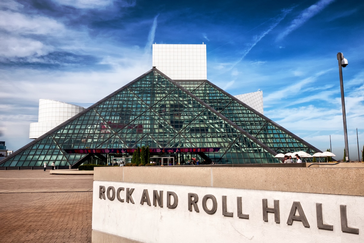
Rock & Roll Hall of Fame in Cleveland, Ohio, U.S. (Photo: Stock Photos from Allen.G/Shutterstock)
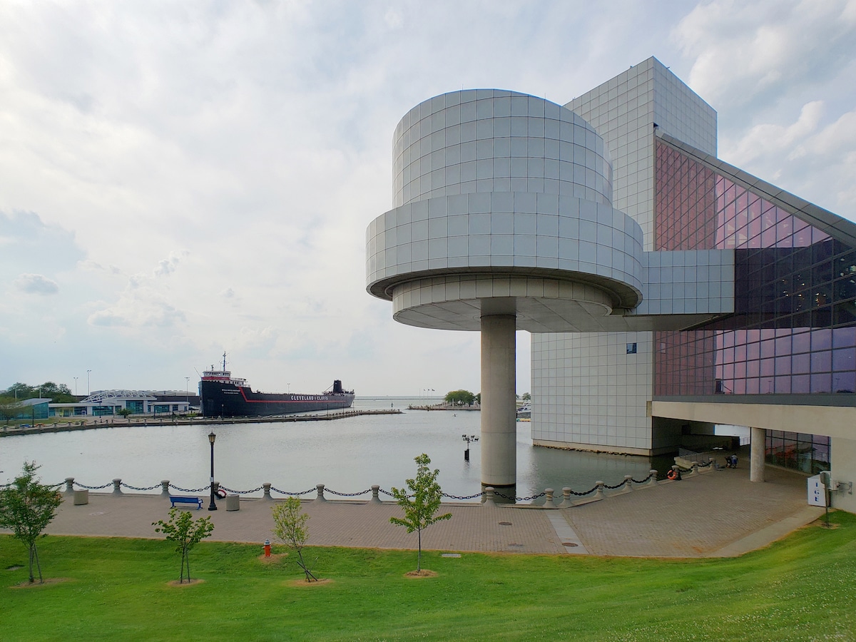
Rock & Roll Hall of Fame in Cleveland, Ohio, U.S. (Photo: Stock Photos from Prosper106/Shutterstock)
The design of Cleveland, Ohio’s Rock & Roll Hall of Fame, often called the Rock Hall, is a great example of museum architecture that really represents the work. Pei’s modernist museum is full of dynamic angular forms that playfully match the energy of rock music. According to Pei, he tried to represent the music style by using “an architectural vocabulary that is bold and new.”
Aside from the glass pyramid, a massive tower is covered in tiles and is connected to expressive geometry like a bridge and cylinder held up on a large column. These playful forms all come together to provide plenty of exhibition space, offices, a gift store, and a café.
Museum of Islamic Art
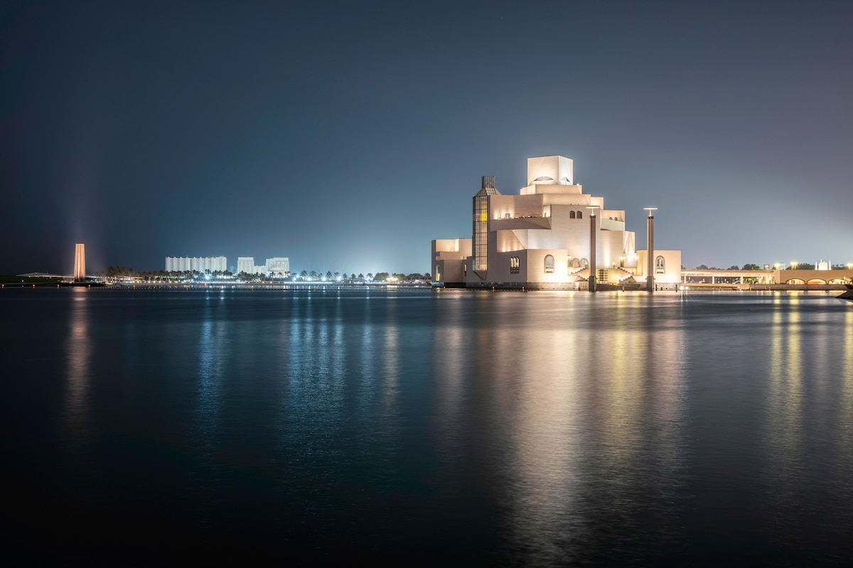
Museum of Islamic Art in Doha, Qatar (Photo: Stock Photos from Davor Flam/Shutterstock)
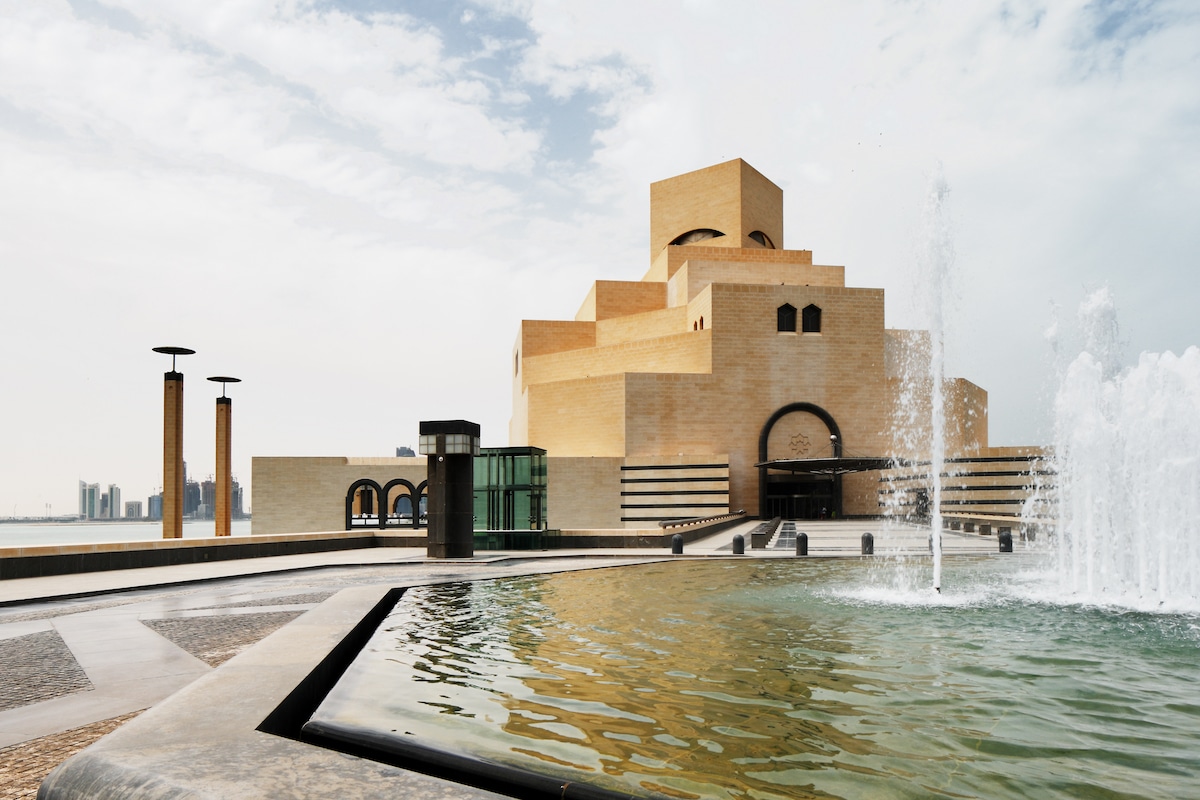
Museum of Islamic Art in Doha, Qatar (Photo: Stock Photos from Sophie James/Shutterstock)
The Museum of Islamic Art in Doha, Qatar is an incredible blend of the intricacy of ancient Islamic architecture and the logic of modernist design. It is no mistake that this project is the last work on our list. Pei was 91 years old when he agreed to design the project, and was convinced to take a break from retirement to complete the museum.
Once Pei agreed, he traveled extensively to learn about Muslim history and design. He also suggested that the project be built on an island in order to always maintain the isolated monumentality of the museum. The organizers followed his suggestion. Pei’s design for the museum itself included a large central tower with a main dome with an exterior covered in a clean limestone.
