An average, flat print advertisement wasn’t good enough for Colombia-based creative director Felipe Salazar. Instead, he wanted to produce an incredibly eye-catching design that really stood out as readers flipped through the pages of a newspaper.
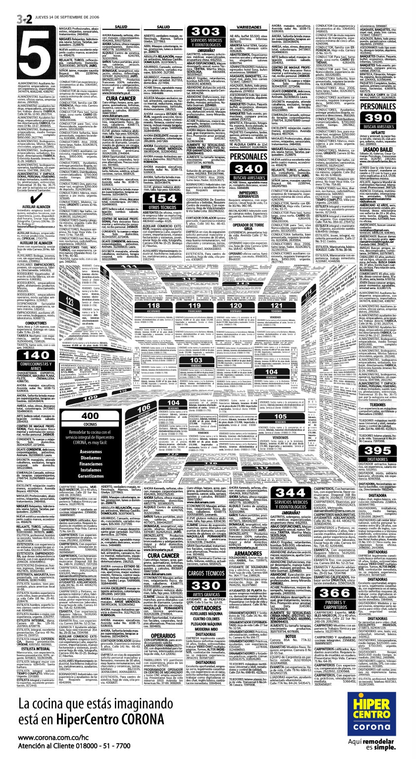
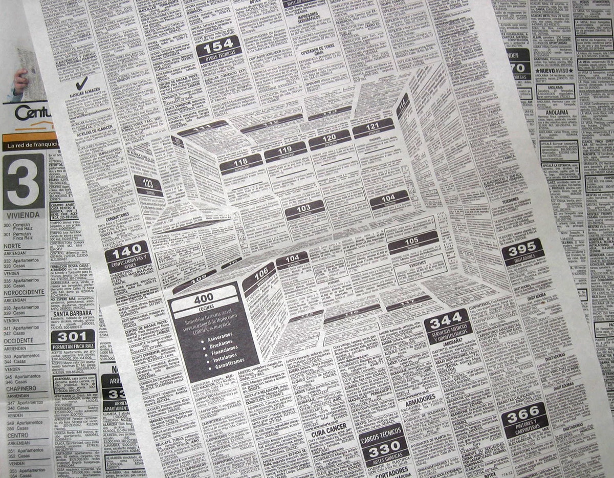
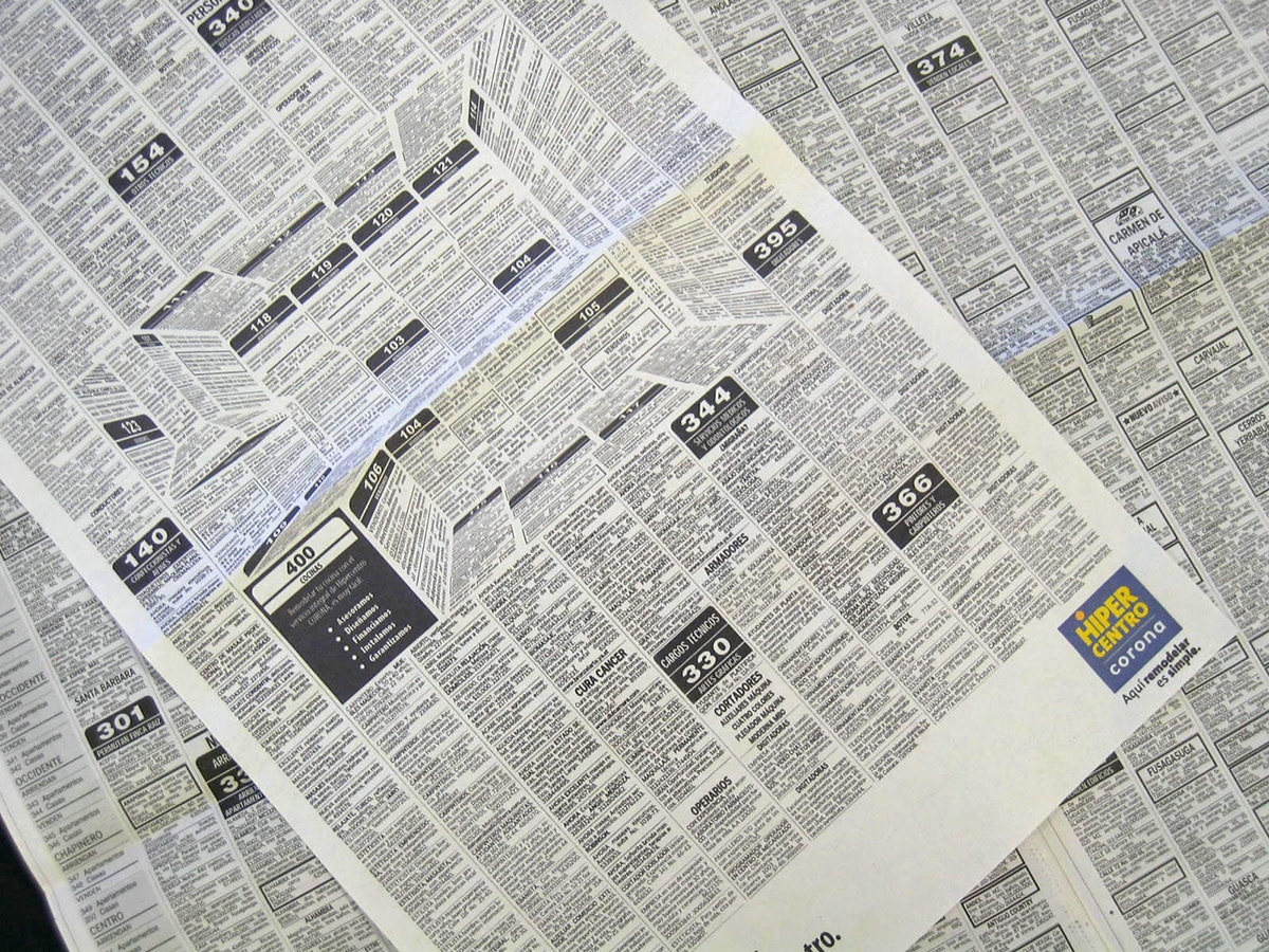
His clever concept, created for Corona Kitchen, looks just like a page from the classifieds section. Upon first glance, it’s obvious that something is unique about the arrangement of elements in comparison to the surrounding black and white text. Viewers will find themselves instantly intrigued by the odd formation of diagonal and skewed lines amid the otherwise flat composition.
Upon further inspection, the incredibly innovative optical illusion reveals itself as a miniature kitchen with everything from countertops to a stove placed directly in the center of the page. With nothing but typography, Salazar created a captivating concept that has certainly drawn the recognition that he intended.


