Photo: rawpixel.com
One of the most important aspects of marketing your creativity is a successful newsletter. It’s a powerful tool for keeping your network abreast of all your latest projects. By keeping your audience informed of what you’re up to, you’re continuing to deepen your relationship with your fans and followers.
Unfortunately, email newsletters can often be an afterthought—slapped together haphazardly in between other tasks. And while you might think what you are doing is good enough, chances are you could greatly improve how people respond to what you’re sending out with just a few tweaks. Remember, a newsletter is only good if people actually open and engage with it.
We’ve pulled together a few basics tips on what you can do to improve your next email newsletter. This way, when you announceme an upcoming exhibition or brilliant new collection, the message is sure to reach the right people.
Spend time on your subject line
Subject lines are one of the most important, but often most undervalued, parts of any email marketing campaign. Think about it, the subject is the first thing you see when something comes to your inbox and if it’s not captivating, that email’s going into the trash.
It helps to think of your subject line as a newspaper headline—short, direct, and appealing. It should immediately tell the recipient what the newsletter is about and entice them to click in. Creating a sense of urgency and appealing to your audience’s sensibilities helps create an emotional response to the headline, getting you more opens. If you aren’t sure if your subject lines are up to par, there are a few tools that can help you get it just right.
The Advanced Marketing Institute evaluates headlines based on their Emotional Marketing Value score. As you want to appeal to people’s emotions in order to get them to open your newsletter, it’s essential to be positive in your wording and select your words carefully for maximum impact. Both the Advanced Marketing Institute and Coschedule have free headline analyzers that will let you know where you fall on the scale and how to improve your headline.
Extra tip: Try formatting your subject line as a question.

Photo: Canva
Re-evaluate your design
Whether you hired a designer or used a pre-existing template, looking at your newsletter design at least a few times a year is always helpful. Keeping things clean, simple, and legible is essential to making sure the content is transmitted and read clearly.
MailChimp, a leader in email newsletters, has a fantastic email design guide with tips and suggestions on how to optimize your design. From fonts and colors to the appropriate use of separators, it takes you step by step through all aspects of email campaign design.
You’ll want to test your newsletter on multiple devices to ensure that it reads well on desktop, mobile, and tablet. As most people are viewing email campaigns from mobile, it’s key that you have a responsive design that will hold up on iPhones, Androids, or any other mobile platform.
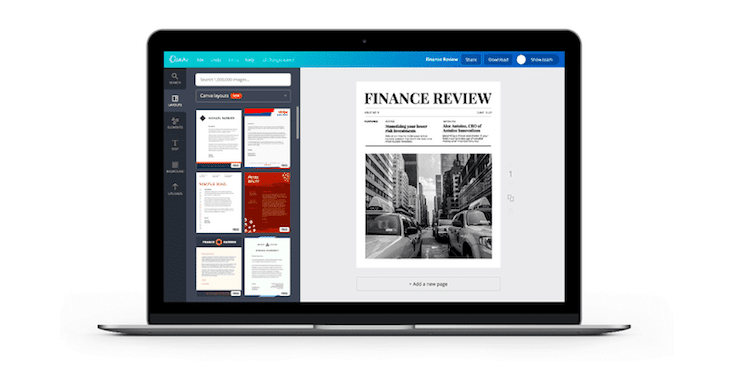
If you want to improve on your newsletter design and can’t afford to hire a designer, Canva is a great place to start. They have lots of free templates that can be customized via a simple interface.
Extra tip: Browse Really Good Emails and get inspired by excellent email design.
