Photo: Markus Spiske
Have you ever wondered what it takes to work for Pantone? The world-renowned color factory requires all of its employees to have near-perfect color vision, meaning they can see subtle hue distinctions that others can’t. To evaluate a person’s level of color vision, Pantone have released a fun online Color IQ Test that challenges your ability to distinguish swatches of similar shades.
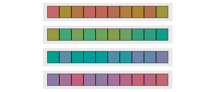
The quick, 2-3 minute color vision test features four distinct grid-like lines with 10 varying swatches for each hue. The aim of the game is to drag and drop each tile, arranging them chromatically so that they align with the first and last swatches of each row. The simple challenge is based on the Farnsworth Munsell 100 Hue Color Vision test, a system typically used to test color blindness. Following the same layout, the rows in Pantone’s Color IQ Test cover orange/magenta hues, yellow/green hues, blue/purple hues, and purple/magenta hues, in that order.
Unlike a typical IQ test, the closer your score is to zero, the better your color vision is—and a score of zero signifies perfect color vision. To achieve accurate results, Pantone recommend that you calibrate your monitor. Take the test on the Pantone website and discover your color vision capability.
Pantone has launched a “Color IQ Test” that allows you to discover your level of color vision.
 Pantone: Website | Facebook | Instagram | Twitter | Pinterest
h/t: [DesignTAXI]
All images via Pantone.
Related Articles:
Designer Perfectly Matches Pantone Color Swatches with Real-Life Landscapes
Designers’ Must-Have App Matches Colors in the Real World with Their Exact Pantone Swatches
Designer Creatively Pairs Food with Their Pantone Swatch Colors
Designer Continues Pairing Tiny Objects with Matching Pantone Swatches
Victorian-Era Color Theory Manual Reissued for the First Time in 115 Years
