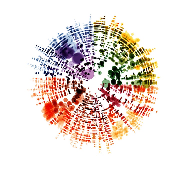
The Four Seasons, Antonio Vivaldi
This post may contain affiliate links. If you make a purchase, My Modern Met may earn an affiliate commission. Please read our disclosure for more info.
Self-described “designer, data geek, fractal nut” Nicholas Rougeux has merged open-source music with data visualization to create colorful imagery based on some of the most famous classical music scores in history. From Mozart and Beethoven to Chopin and Vivaldi, it’s fascinating to see how these well-known pieces translate into artistic data visualizations.
For Off the Staff, Rougeux relied on MuseScore (free music notation software which allows community members to share sheet music) and OpenScore (a project that aims to “digitize and liberate all public domain sheet music”). Interestingly, Rougeux himself can’t read sheet music, but he’s able to parse it, pulling out single notes from the scores. Each individual instrument is represented by a different color, resulting in the brightly hued imagery, which is available as posters.
“Every time I extract data, I never know what it’s going to look like,” Rougeux tells My Modern Met. “I had some inklings for some pieces like Flight of the Bumblebee with its rises and falls but even that one surprised me.” To create his visualizations, Rougeux altered the traditional representation of scale, typically noted by the different clefs on sheet music.
“I did away with that and showed all notes in their natural position on the scale—distance from center—no matter how high (farther) or low (closer) they were. Essentially, while sheet music shows notes from different scales on the same staff, my project shows different staffs on the same scale—hence the name, Off the Staff.”
In terms of color scale, he typically tries several different shades and hues to see what works best, as he never knows the final result until the visualization is complete.
The self-taught web developer and artist hopes that Off the Staff will allow people to see music in a different way and reveal something hidden within the notes. By taking something people naturally consume using their auditory skills, he enjoys flipping the experience on its ear by appealing to different senses. Surprises are sure to be discovered and Rougeux appreciates hearing what people take away from his work.
Off the Staff is a data visualization project that translates famous classical music scores into colorful imagery.

Allegro, Eine kleine Nachtmusik, Wolfgang Amadeus Mozart
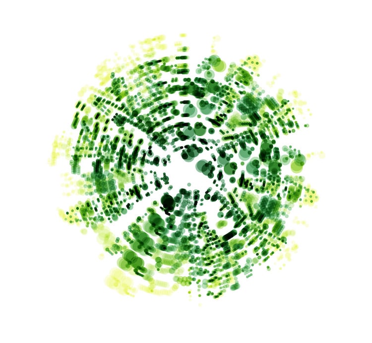
Allegro con brio, Symphony No. 5, Ludwig van Beethoven

Cannon in D, Johann Pachelbel
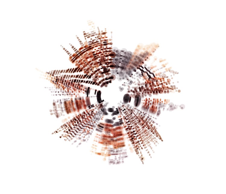
1812 Overture, Pyotr Ilyich Tchaikovsky
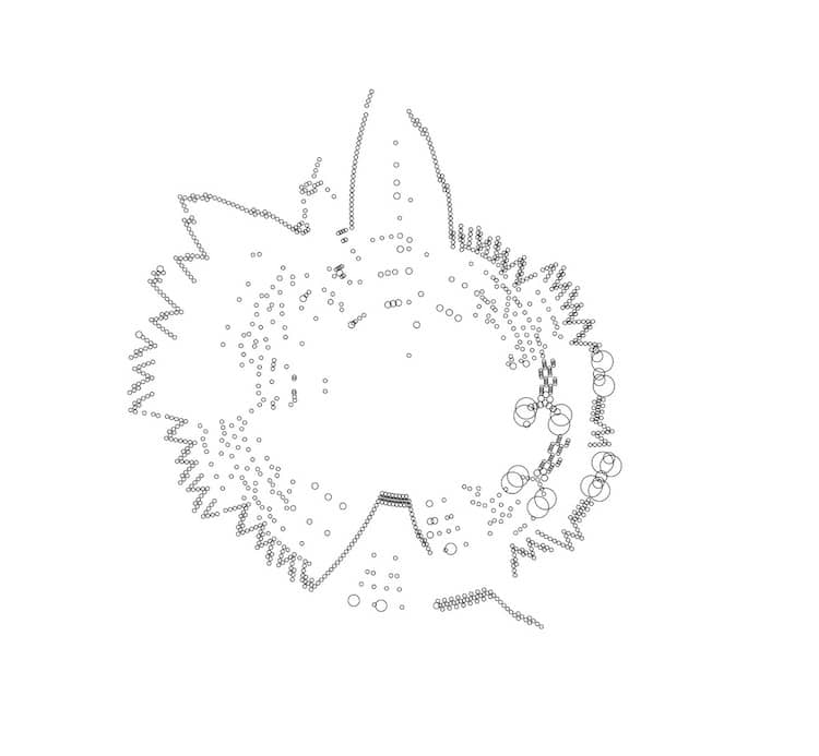
Flight of the Bumblebee, Nikolai Rimsky-Korsakov
Each instrument in the score is represented by a different color.

Hallelujah, Messiah, George Frideric Handel
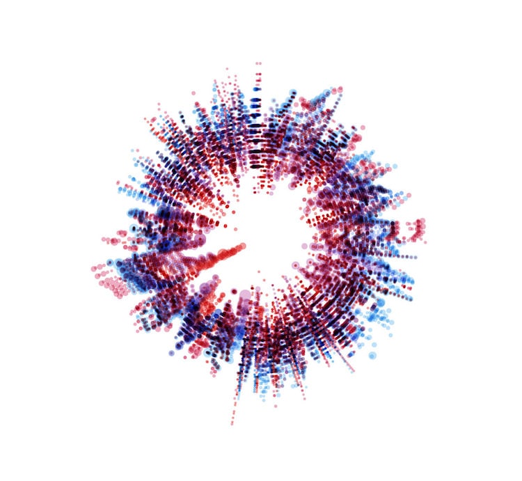
Piano Quintet No. 2, Gabriel Fauré
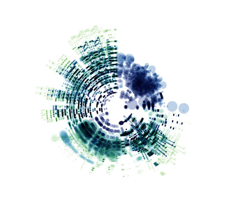
William Tell Overture, Gioachino Rossini
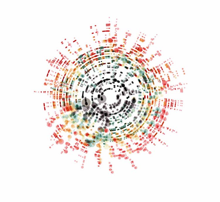
Quintet, Luigi Boccherini
Creator Nicholas Rougeux used open-source data from MuseScore and OpenScore to complete the project.

Wedding March, Felix Mendelssohn
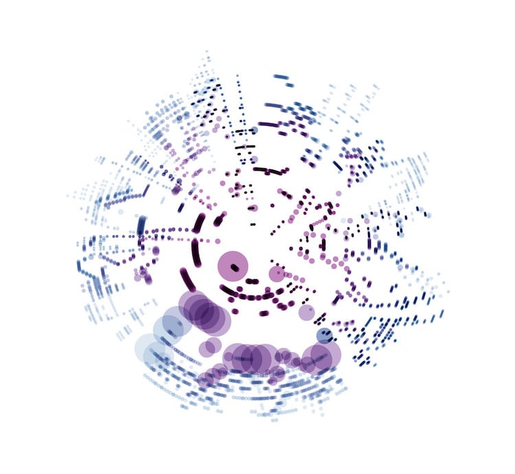
The Four Seasons: Winter, Antonio Vivaldi

The Barber of Seville Overture, Gioachino Rossini
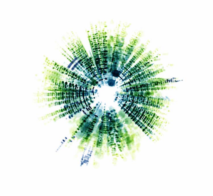
Symphonie fantastique, Hector Berlioz
You can also watch each piece as the mesmerizing visualization unfolds.
Nicholas Rougeux: Website | Facebook | Instagram | Behance | Zazzle
My Modern Met granted permission to use photos by Nicholas Rougeux.
Related Articles:
Spectacular Visualizations of Brain Scans Enhanced with 1,750 Pieces of Gold Leaf
