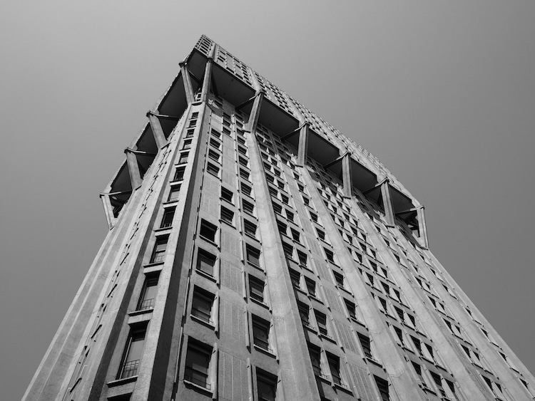
Torre Velasca by BBPR. 1958, Milan, Italy. (Photo: Stock Photos from Claudio Divizia/Shutterstock)
This post may contain affiliate links. If you make a purchase, My Modern Met may earn an affiliate commission. Please read our disclosure for more info.
They say that trends are circular and what’s old becomes new again. This is true for fashion, music, and art. In the case of architecture, there’s no architectural style that exemplifies this principle better than Brutalism. From the mid-20th century, this style rose in popularity before reaching its peak in the mid-1970s, when it came crashing down as a model of bad taste. But that’s all changing now, with a renewed interest and appreciation for this once derided architectural style.
Known for its use of functional reinforced concrete and steel, modular elements, and utilitarian feel, Brutalist architecture was primarily used for institutional buildings. They were also used for important residential buildings in order to rationally address the critical need for housing. Imposing and geometric, Brutalist buildings have a distinct graphic quality that is part of what makes them so appealing today. But why is brutalism called brutalism, is it because of its “brutal” and rough appearance? The word Brutalism doesn’t come from its harsh aesthetic, but from the material it is made of. Béton brut is a French term that translates literally to “raw concrete” and is also used to describe the iconic aesthetic known as Brutalist architecture.
Associated with schools, churches, libraries, theaters, and social housing projects, Brutalism is often intertwined with 20th-century urban theory that looked toward socialist ideals. With the need for construction after World War II, Brutalism took hold around the world, but particularly in the UK and Eastern European Communist countries, where it was sometimes used to create a new national socialist architecture. Brutalism and Brutalist architecture were influenced by all of these post-war problems and the modernist idea that rational design could produce the best architecture.
If you are familiar with architectural history, you may think that a lot of these ideas seem to overlap with modernism. Brutalism is actually a specific branch of modern architecture. Since it is so distinct, some believe it must be an example of postmodern architecture in response to earlier styles, but this is not true. It is, like most modernisms, a study of the simplest possible solution to a spatial or programmatic problem. It was also especially conscious of integrity or honesty when expressing the material used in the architecture—hence the usage of often blank concrete walls.
The Origins of Brutalism
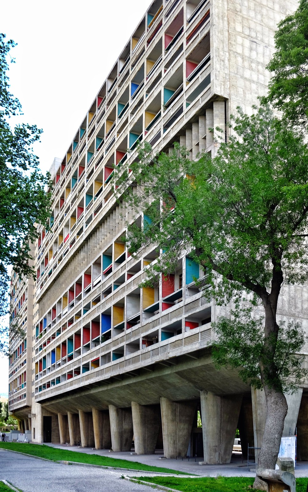
Some believe that Swiss-French architect Le Corbusier‘s love of concrete may have started Brutalism. The Unité d’Habitation in Marseilles, France was his first project in 10 years, World War II having interrupted his practice. Completed in 1952 and created as housing for the working class, Le Corbusier’s design called for a giant reinforced concrete framework fit with modular apartments. The mammoth complex, which could house up to 1,600 people, was largely devoid of decorative elements and laid the framework for future Brutalist projects.
The word “Brutalism” in relation to architecture was first coined by a Swedish architect, Hans Asplund, to describe a square brick home called the Villa Göth in 1949. Brutalism officially started around this time period and quickly spread. The trend was picked up by English architects where the style was further honed by Alison and Peter Smithson. Together they are particularly known for East London’s Robin Hood Gardens council housing complex. Completed in 1972, it was built from precast concrete slabs and though built with the Smithsons’ ideals for ideal living, it never quite lived up to its goals. In 2017 the eastern block was demolished as part of a refurbishment plan. But to show how far Brutalism has come, the Victoria & Albert Museum acquired three stories of the demolished building.
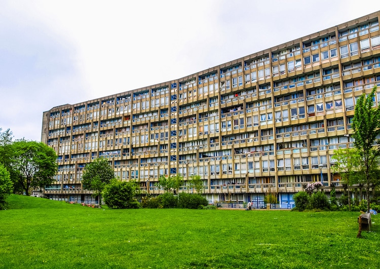
Robin Hood Gardens by Alison and Peter Smithson. 1972, London, England. (Photo: Stock Photos from Claudio Divizia/Shutterstock)
The Fall of Brutalism
Heading into the 1980s, Brutalism fell out of favor. Part of this was due to the cold and austere nature of the architecture, which was often associated with totalitarianism. Another mark against Brutalism was that the raw concrete used in construction didn’t age well, often showing signs of water damage and decay that brought down the overall aesthetic.
British author Anthony Daniels, who uses the pen name Theodore Dalrymple, called the reinforced concrete of Brutalism “monstrous,” pointing out that it “does not age gracefully but instead crumbles, stains, and decays.” He blamed Le Corbusier for architects’ love of concrete, stating that a “single one of his buildings, or one inspired by him, could ruin the harmony of an entire townscape.”
Aside from the aging of concrete, Brutalism seems especially hated. This is because cities were struggling to deal with the need for quick and efficient housing. Since housing is such a complex problem, tensions were high as housing projects struggled with maintenance issues, crime, and other problems. Brutalism came to symbolize urban decay and economic hardships that were out in the open for the world to see. Raw concrete made the perfect canvas for graffiti artists, whose vandalism only contributed to the decline of these structures. Throughout the 1980s, the style gave way to the High-tech architecture and Deconstructivism, which would make way for Post-Modern architecture.
Countless Brutalist buildings have been torn down since the style went out of fashion in the ’80s. While some consider them eyesores, many others believe that their destruction is both losing a piece of history and losing a piece of beautiful architecture. Still, many examples of Brutalism can still be found throughout the world, especially in London and notable American and Canadian cities.
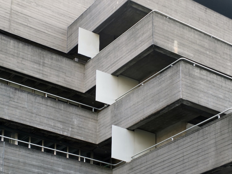
Photo: Stock Photos from Philip Openshaw/Shutterstock
New Appreciation for Brutalism
Over the past 5 years, a new appreciation for Brutalism has emerged. Books like SOS Brutalism: A Global Survey, How to Love Brutalism, Soviet Bus Stops, and This Brutal World all celebrate the artistry of the architectural style. Virginia McLeod, the editor of Phaidon’s Atlas of Brutalist Architecture, first noticed a renewed interest in Brutalism on Instagram.
“I noticed more and more interest in brutalist architecture,” she says. “People were excited about it and loved the graphic quality of it.” The hashtag #brutalism has over 500,000 images and conservation groups are increasingly trying to save examples of Brutalism, which are all too often demolished without a second thought.
New Brutalist projects are even being built with distinct monumental concrete volumes, though the revival is often branded as “Neo Brutalism.” No one knows exactly why Brutalism has become fashionable once again, but Brad Dunning of GQ has an interesting theory: “Brutalism is the techno music of architecture, stark and menacing. Brutalist buildings are expensive to maintain and difficult to destroy. They can’t be easily remodeled or changed, so they tend to stay the way the architect intended. Maybe the movement has come roaring back into style because permanence is particularly attractive in our chaotic and crumbling world.”
Take a look at some of the world’s finest examples of Brutalist architecture.
Geisel Library by William Pereira. 1970, San Diego, CA
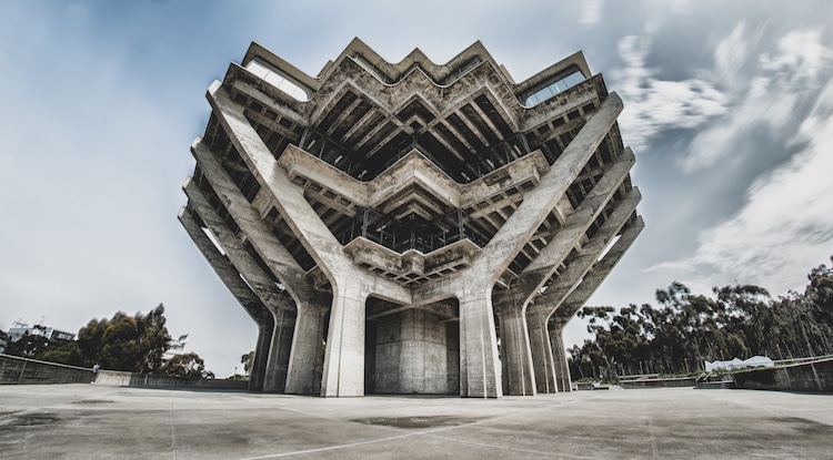
Photo: Stock Photos from Ryan Kelehar/Shutterstock
The main library at the University of California, San Diego, the Geisel Library is so iconic that it features in the school’s logo. Architect William Pereira is known for his futuristic style and, in fact, the building is often called a combination of Brutalism and Futurism. Pereira designed the structure to look like hands holding up a stack of books.
National Library of the Argentine Republic by Clorindo Testa. Designed 1961, Buenos Aires
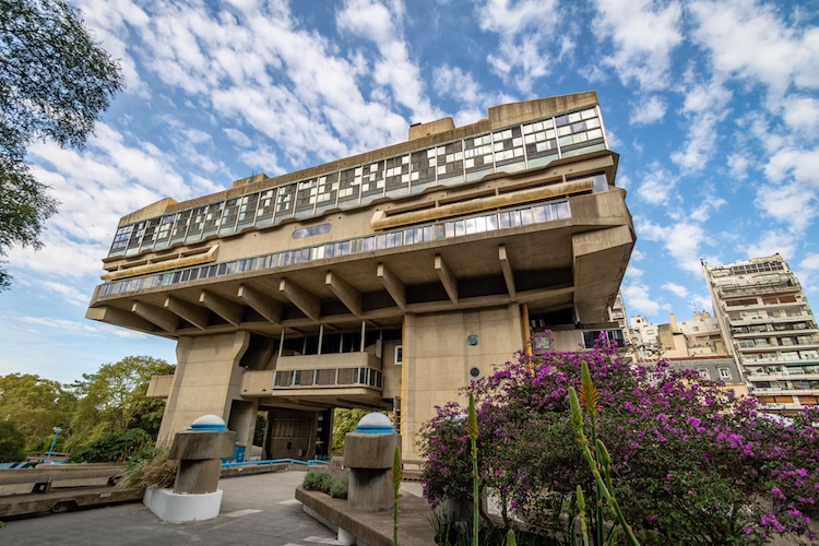
Photo: Stock Photos from Diego Grandi/Shutterstock
Argentina’s National Library was designed by Clorindo Testa, who is credited with helping bring the Brutalist movement to Argentina. The building was designed in 1961 and was built on the former grounds of Unzué Palace, where the residence of former president Juan Perón and his wife Evita had lived. Construction didn’t actually begin until 1971, with the library being inaugurated in 1992. Political upheaval and continual changes in leadership led to long delays in the execution of Testa’s vision.
Habitat 67 by Moshe Safdie. 1967, Montreal
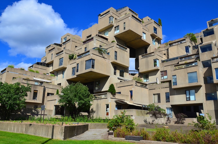
Photo: Stock Photos from meunierd/Shutterstock
This model community and housing complex was originally architect Moshe Safdie‘s master’s thesis. It was later constructed for the 1967 World’s Fair. Made up of identical, prefabricated concrete blocks, Safdie aimed to bring aspects to suburban living into an urban environment. This included gardens, fresh air, and privacy. Habitat 67 is now one of the most recognizable buildings in Montreal.
Boston City Hall by Kallmann McKinnell & Knowles. 1968, Boston, MA
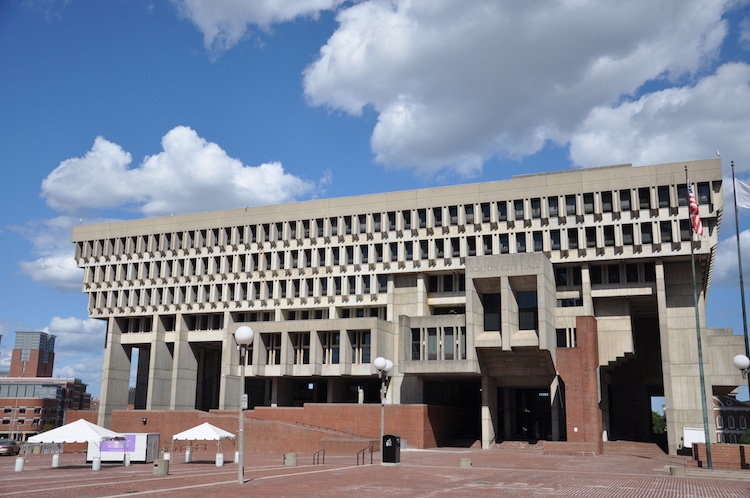
Photo: Stock Photos from jiawangku/Shutterstock
Since it was constructed in the 1960s, Boston City Hall has divided public opinion. There are many who consider it an ugly building, while others applaud it as a fine example of American architecture. The building was intended to make a statement about modern civic democracy and the building is split into different levels defined by function. The lower levels are often accessed by the public, while the intermediary levels house public officials. The large protrusions on the building at these levels are intended to create a connection between the government and the city.
Barbican Estate by Chamberlin, Powell, and Bon. 1968–79, London
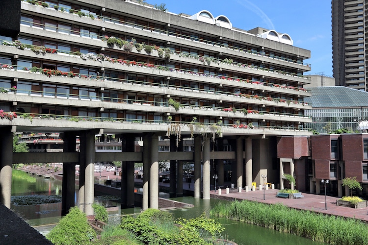
Photo: Stock Photos from Tupungato/Shutterstock
Located in the City of London, Barbican Estate is a towering complex of about 2,000 apartments and houses mixed with cultural buildings. It is one of the most prominent examples of British Brutalist architecture and is a Grade II listed building. One of the most iconic parts of the complex is the terrace blocks raised up on podiums surrounded by a lake and green squares.
Telecommunication Centre and Central Post Office by Janko Konstantinov. 1989, Skopje, Macedonia
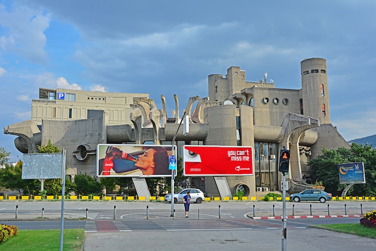
Photo: Stock Photos from Martyn Jandula/Shutterstock
This incredible building was part of a large plan to rebuild Skopje after a devastating earthquake in 1963. Architect Janko Konstantinov uses concrete in a sculptural manner to bring a decorative effect to a building without cladding. In the Telecommunication Centre and Central Post Office the raw, exposed concrete takes center stage.
Royal National Theater by Sir Denys Lasdun. 1976, London

Photo: Stock Photos from Ron Ellis/Shutterstock
Popular opinion is split on London’s Royal National Theater, with Prince Charles once calling it a “clever way of building a nuclear power station in the middle of London without anyone objecting.” Instead, architecture enthusiasts appreciate Denys Lasdun‘s harmonious use of horizontal and vertical elements. Lasdun also attempted to keep the public in mind when designing the space, using large outdoor terraces to engage the public.
TripleOne Somerset by Group 2 Architects. 1971, Singapore
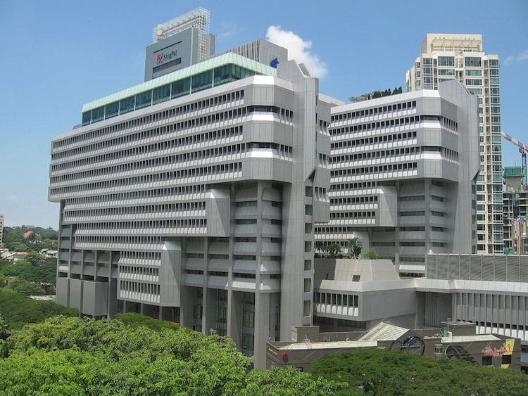
Photo: Sengkang via Wikimedia Commons (GFDL or CC BY-SA 3.0)
Prior to its renovation in 2016 when it was clad in metal, shopping mall and commercial center TripleOne Somerset showed its Brutalist roots through a raw concrete façade. Influenced by the design of Boston City Hall, the building has an emphasis on the horizontal. This is evidenced by the protruding rows of staggered fins that create movement and provide shade.
Pirelli Tire Building by Marcel Breuer & Robert F. Gatje. 1969, New Haven, CT
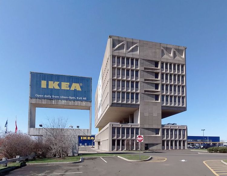
Photo: Gunnar Klack via Wikimedia Commons (CC BY-SA 4.0)
This former office building, which is on the National Register of Historic Places, has been converted into the Hotel Marcel. The architects conceived the Pirelli Tire Building to house the company’s administrative offices, suspended above the research and development space. The two-story negative space in between was to help reduce the sound from the development labs in the above offices. Unfortunately, what we see now is not a complete picture of the original architecture, as the adjacent IKEA store demolished a portion of it to create a parking lot.
Trellick Tower by Ernő Goldfinger. 1972, London
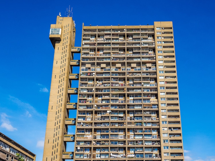
Photo: Stock Photos from Claudio Divizia/Shutterstock
When Ernő Goldfinger designed London’s Trellick Tower, it was intended to replace outdated social housing. Goldfinger’s design includes 217 apartments, all of which have balconies. Special touches like sliding doors help save space while large windows give residents access to natural light. After going through a period of high crime, Trellick Tower is now a desirable place to live and its concrete construction helped save it from a 2017 fire.
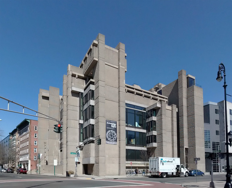
Rudolph Hall, Yale Art & Architecture Building by Paul Rudolph. 1963, New Haven, CT
One of the earliest examples of Brutalist architecture in America, Rudolph Hall houses the Yale University School of Architecture. Architect Paul Rudolph was greatly influenced by both Frank Lloyd Wright and Le Corbusier. Made of textured concrete, it has a complex floor place with over 37 terraced levels spaced across seven stories.
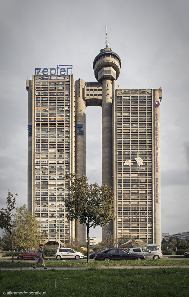
Western City Gate by Mihajlo Mitrović. 1979, Belgrade
Also known as the Genex Tower, this 36-story skyscraper in Belgrade is designed in the shape of a gate meant to greet people coming into the city. Its location along the road leading from the airport into the city center makes it the perfect gateway. The smaller tower is now empty but was once occupied by the state-run Genex Group. The taller tower, which is still in use, is residential. Western City Gate is a dominant monument in Belgrade and the 2021 declaration putting it under special protection calls it an “urban lighthouse.”
This article has been edited and updated.
Related Articles:
Get a Crash Course in Modernist Architecture With 8 Styles That Define the Movement
100 Architecture Terms That Will Help You Describe Buildings Better
16 Must-See Films To Inspire Architects and Architecture Lovers
Exploring the Extravagance and Drama of Baroque Art and Architecture

