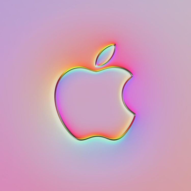
Apple
This post may contain affiliate links. If you make a purchase, My Modern Met may earn an affiliate commission. Please read our disclosure for more info.
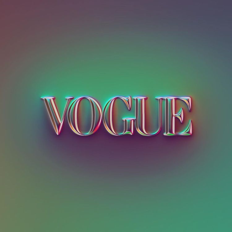
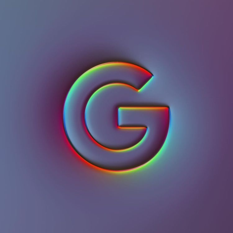
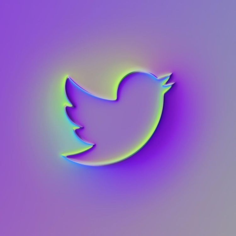
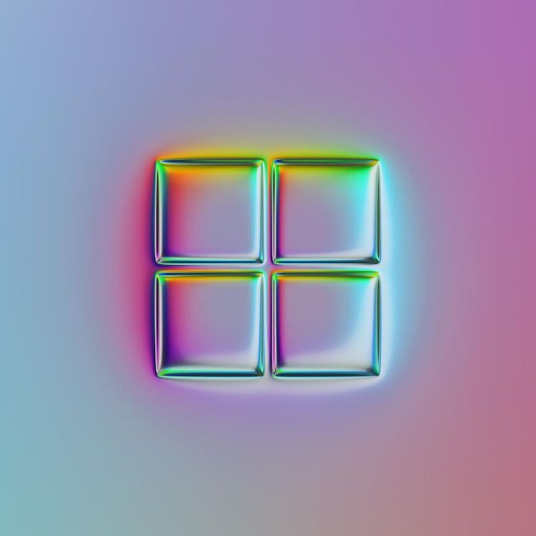
When scrolling through the apps on your phone, how many do you recognize purely by their logo? Companies like Apple, Netflix, and Twitter all have their own brand image that’s captured in a single icon; however, German graphic designer Martin Naumann recently decided to visually reimagine what iconic logos would look like in his own, vibrant style. His 36 logos series sees famous emblems transformed into striking, chromatic symbols.
“I create most of my work through generative and parametric design techniques, which means that chaos and randomness play a big role in my creative process,” says Naumann. “My goal is to create visual experiences, nobody has seen before.” Naumann certainly achieved what he set out to do. From Apple and Google to UPS and NBC, he has transformed 36 recognizable logos into futuristic icons. Each one looks as though it comes from an alternate universe, where the companies we all know have been rebranded to suit an ultra-modern world.
“When I started working on this technique, I didn’t have any clear vision in my head of what it’s gonna look like at the end,” Naumann tells My Modern Met. “For me, it’s like a mix between this rough chrome typography trend and the minimal UI design style ‘Neumorphism.’” Characterized by its three-dimensional textures, neumorphism is a popular style among contemporary graphic designers. However, Naumann takes the look a step further by creating logos that appear to be made from holographic metal.
Naumann began creating different letters in his distinct, polished chrome style, as part of the 36daysoftype challenge. However, he soon looked to iconic logos as a way to experiment with the style even further. “As I liked the look and variety of this technique, I also explored different motifs and wanted to see how it could be applied to brands as well,” he says. “I tried to create my own interpretation of the individual logotypes—inspired, but mostly deviating from the brand guidelines.
“I created this series, like most of my work, by using a generative node script in Filter Forge. It’s a parametric image editing/texture program.” And for those interested in the specifics of how exactly the look was achieved, Naumann explains: “The logo shapes were blurred exponentially to create a soft bump map as a base shape. For the color gradients, I use a large-scaled RGB noise texture which is refracted on the bump map.”
Check out Naumann’s 36 logos series below, and find more of his eye-catching designs on Behance.
Graphic designer Martin Naumann’s 36 logos series sees famous logos transformed into futuristic, chromatic emblems.
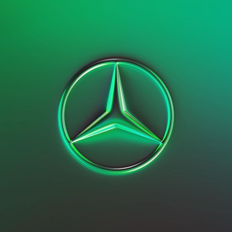
Mercedes-Benz
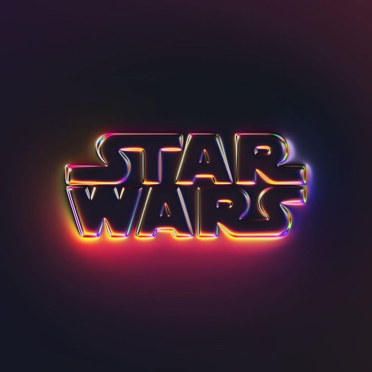
Star Wars
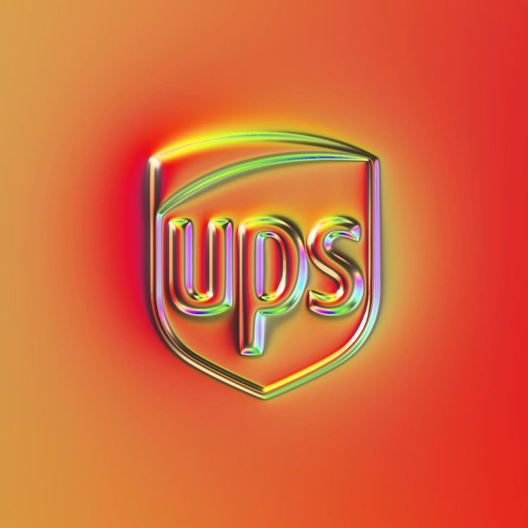
UPS
Each one looks as though it comes from an alternative universe, where the companies we all know have been rebranded to suit an ultra-modern world.
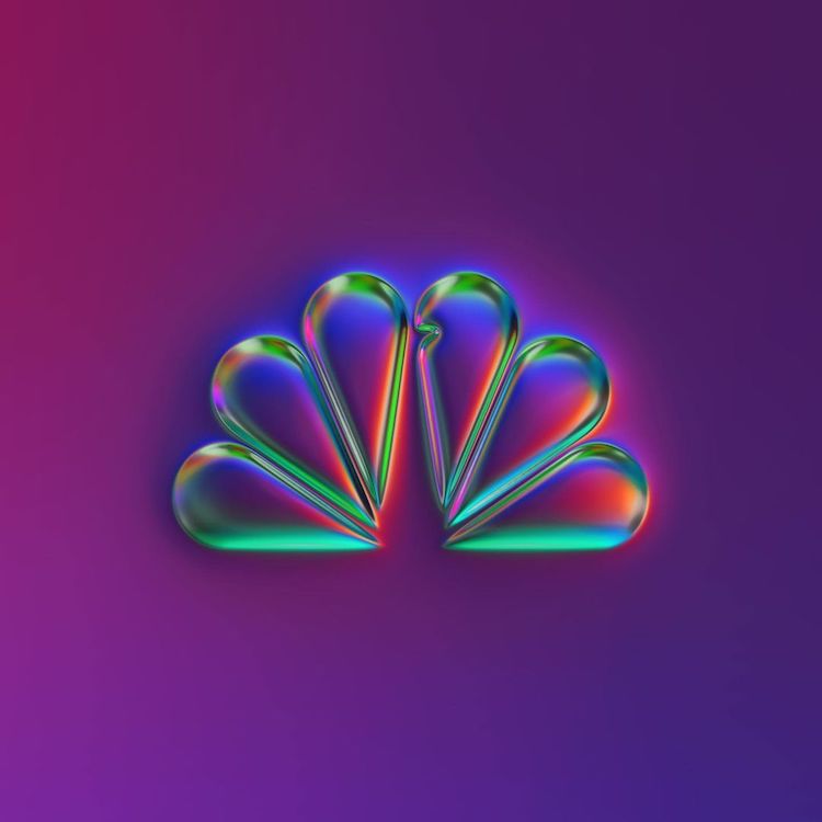
NBC
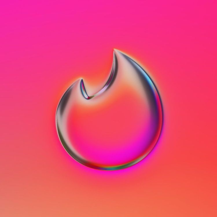
Tinder
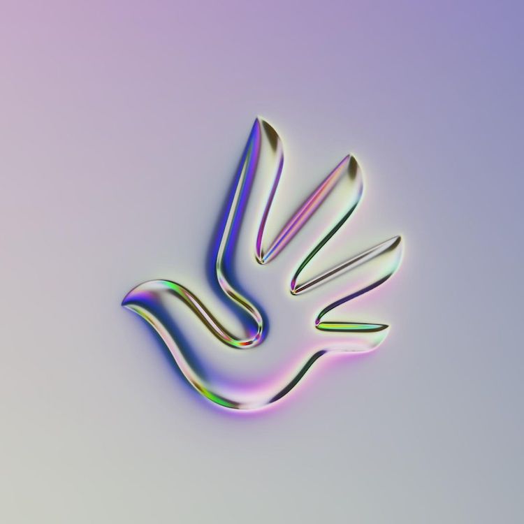
Human Rights
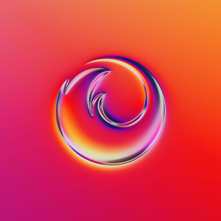
Firefox

Slack
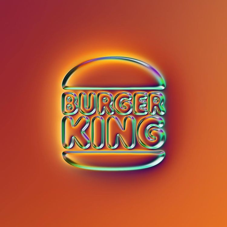
Burger King
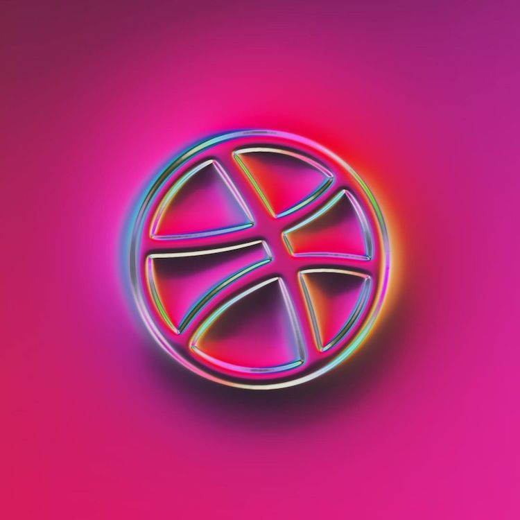
Dribbble
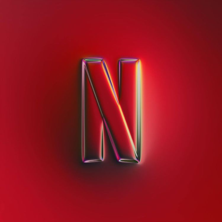
Netflix
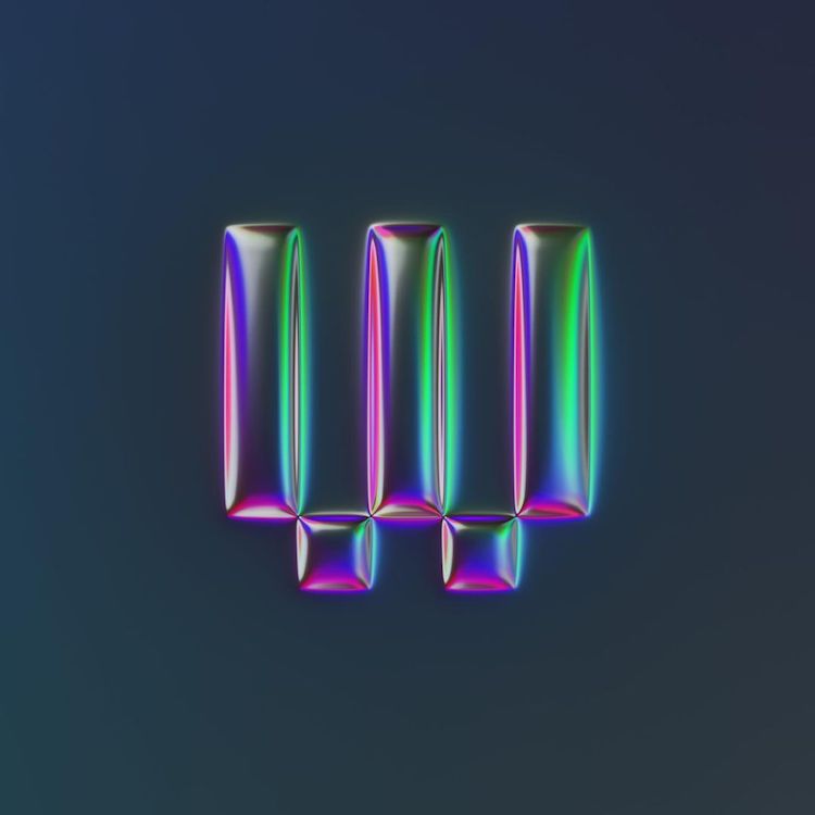
Wired
Vogue
Microsoft
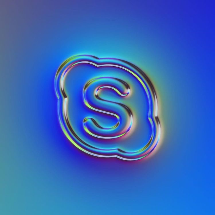
Skype
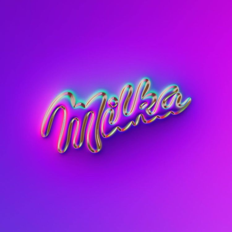
Milka
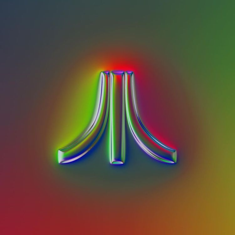
Atari
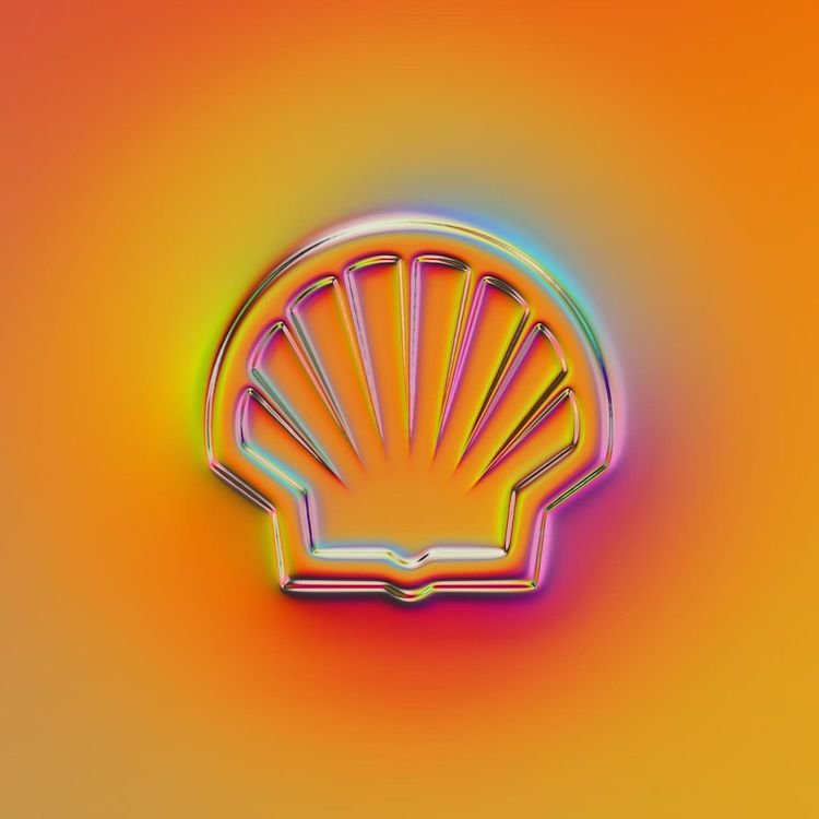
Shell
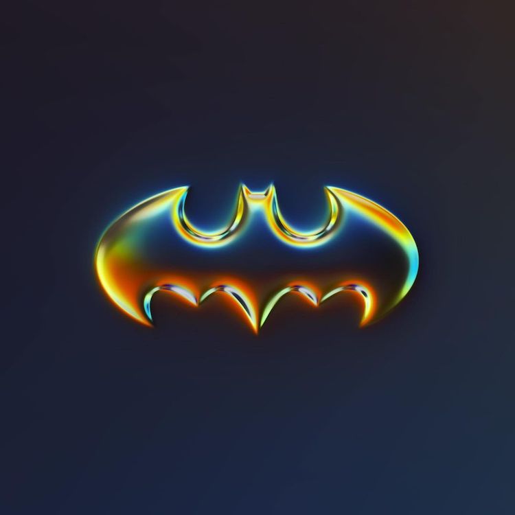
Batman
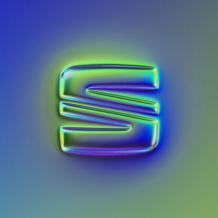
SEAT
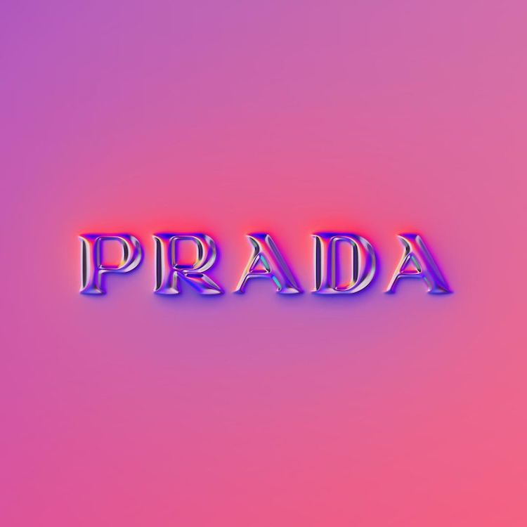
Prada
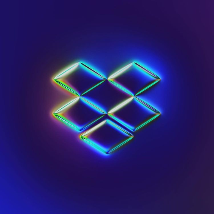
Dropbox
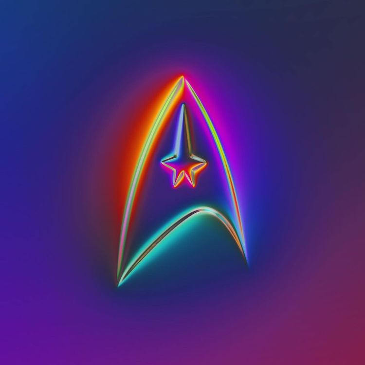
Star Trek
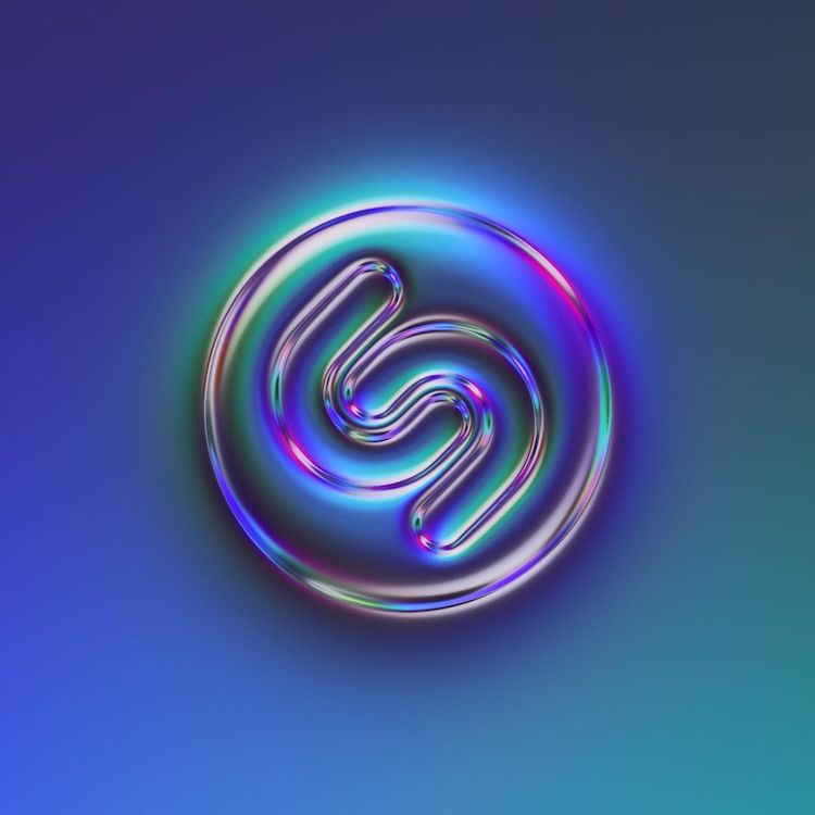
Shazam
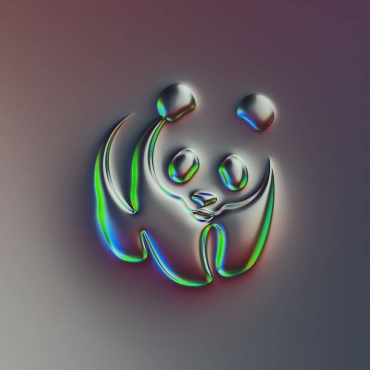
WWF
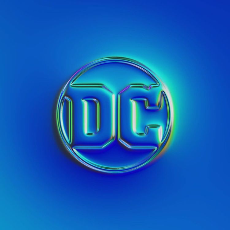
DC
Martin Naumann: Facebook | Instagram | Behance | Pinterest | Society6
My Modern Met granted permission to feature photos by Martin Naumann.
Related Articles:
Graphic Designer Reimagines Iconic Logos in the Age of Coronavirus
Logos of the World’s Biggest Brands Redesigned in the Bauhaus Style
Designer Spends a Year Creating Logos That Subtly Reveal the Meaning of Words
150 People Attempt to Draw World’s Famous Logos Completely From Memory
